In this Power BI tutorial, we will see 5 simple and Powerful Power BI dashboard examples. Here are the examples:
- Customer Segmentation Dashboard
- Product sales Dashboard
- Sales Analysis Dashboard
- Financial Analytics Dashboard
- Human Resource Management Dashboard
What is Power BI Dashboard?
Power BI Dashboard is a collection of multiple visualizations on a single page, also it is known as canvas. It is a high-level business data view. The visualization we see in the power bi dashboard is called tiles and it can pin to the dashboard by the report designer.
If you are new to Power BI, read an article on What is a Power BI dashboard and how to create a dashboard in Power BI step by step.
Power BI dashboard examples [Best 5 Picks]
Let us check out the 5 best Power BI Dashboad examples.
Read: Microsoft Power bi report vs dashboard
Example 1: Customer Segmentation Dashboard
For this Power BI Dashboard, I have used an excel spreadsheet, you can download from here.
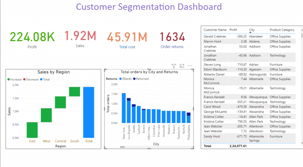
The customer segmentation dashboard in Power Bi is used in business-to-business enterprises. This power bi dashboard helps the senior manager to visualize and track the revenue, profitability, and loss.
It displays the total profit, sales, and order returns from the individual customer.
The customer segmentation dashboard in Power Bi provides data about which category of the product having more sales and profit in which city or region of a country.
In the Customer segmentation dashboard in power bi we use different types of visualizing these are
- Card: The card visualization in power bi is used to display the single number data, which is an important thing to track in your power bi dashboard or report. In the customer segmentation dashboard example we use the card to display the total profits, Total cost, Total order returned, and total sales.
- Waterfall chart: This type of visualization in Power bi is used to show running totals as power bi adds and substracts values. In the waterfall charts, the columns are color-coded, so you can quickly notice the increment and decrement. This example displays the total sales in each region of the country.
- Stacked Column chart: This type of visualization in Power bi is a basic excel chart type to allow the part to the whole comparison over time or across categories. The data series in the stacked column chart is stacked one on top of the other in vertical columns. In customer segmentation dashboard examples in power bi, we use a stacked column chart to display total orders in each city and the total number of order returns.
- Table: This type of visualization in power bi are visualized in a grid views where the related data are displayed in rows and column. In this customer segmentation dashboard example of power bi, we use a table to display the profit by each customer, city, and product category.

Example 2: Product sales Dashboard
For this Power BI Dashboard, I have used an excel spreadsheet, which you can download from here.
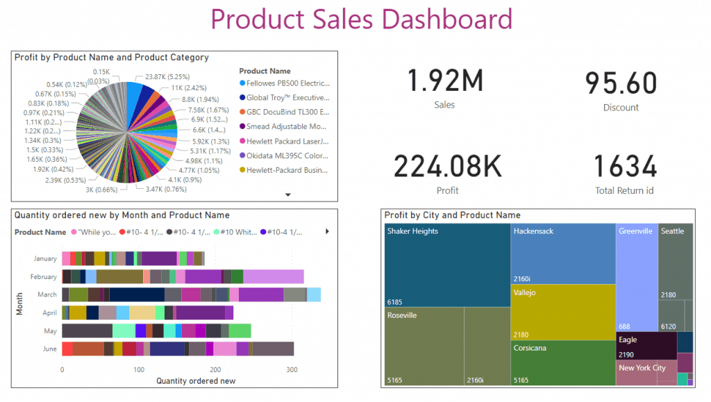
The product sales dashboard focuses more on the sales channel and this type of power bi dashboard are useful for the organization having an e-commerce presence.
In the product sales dashboard we use different types of visualization like below:
- Card: This visualization in power bi is used to display the single number data, which is the important thing to track in your power bi dashboard or report. In this power sales dashboard example, we use the card to display total sales, total discount, total profit, and total order return.
- Pie chart: The pie chart in power bi is very useful to visualize high-level data. In this product sales dashboard, we use a pie chart to display profit by product name and product category, this will tell in which product and product category having profit.
- Stacked bar chart: This visualization represents the Axis on Y-axis and the value on X-axis and it is useful to compare multiple dimensions in a single measure. In this power bi dashboard example, we use a Stacked bar chart to see the number of quantity order every month with the product name
- Treemap: This visualization in power bi displays the hierarchical data as a set of nested data. In treemaps, each level of the hierarchy is represented by a colored rectangle which is known as a branch and contains a smaller rectangle called leaves. In the product sale dashboard example, we use Treemap to display the profit by city and product name.

Example 3: Sales Analysis Dashboard
For this Power BI Dashboard, I have used an excel spreadsheet, you can download from here.
The sales analysis dashboard in Power bi is tried to bring more information about the products and the region. The sales analysis dashboard shows the revenue coming from different customer segments. It displays the profit and unit sold in each of the active regions and the value of discounts offered.
In the sales analysis dashboard we use different types of visualization these are
- Card: This visualization in power bi is used to display the single number data, which is the important thing to track in your power bi dashboard or report. In the sales analysis dashboard, we use the card to display total sales, total discount, total profit, total cost, and the total number of quantities.
- Line and Stacked Column Chart: In power bi this visualization is the combo charts, that combine the line chart and the column chart. By combining the two visuals, we can make a quick comparison between two sets of measures. In the sales analysis dashboard, we use line and stacked column charts to display the sales by customer segment.
- Funnel: In the power bi dashboard, this visualization helps to visualize a linear process that has sequential connected stages. In the sales analysis dashboard, we use the funnel to display the discount of the product category.
- Donut chart: In power bi, this visualization is similar to a pie chart and it shows the relation of parts to a whole and the only difference is the center is blank where you can put an icon. In the sale analysis dashboard, we use a donut chart to display the profit by product name and city.
Download Power bi dashboard examples pbix file

Example 4: Financial Analytics Dashboard
For Example-4, Download the excel spreadsheet from here.
Financial Analytics Dashboard in power bi allows one to view the revenue and profitability from different geographies, product segments, and customer segments.
The financial analytics dashboard allows the financial analyst to go deep into each of these categories and also analyze the financial performance indicator.
In this financial analytics dashboard we use different types of visualization
- Card: This visualization in power bi is used to display the single number data, which is the important thing to track in your power bi dashboard or report. In the financial analysis dashboard example, we use a Card to display the total profit, total sales, and total gross sales.
- Line chart: This visualization in power bi is used to represent series of data points connected by a straight line. Also, it is used to represent continuous data. In the financial analysis dashboard example, we use a line chart to display the sales by profit.
- Gauge: This visualization in power bi is used in business intelligence and performance management. In power bi, the gauge chart shows the maximum and minimum values against the target value. In the financial analysis dashboard example, we use the gauge chart to display profit, unit sold, and total sales, and in another gauge, it displays the gross profit percentage.
- Pie chart: The pie chart in power bi is very useful to visualize high-level data. In the financial analytics dashboard, we use a pie chart to display profit by sales and month.
- Matrix: This visualization in power bi automatically aggregates the data and enables you to drill down. In the financial analytics dashboard, we use the matrix to display the total sales, profits, and units sold in each month.
- Tree-map: This visualizes in power bi displays the hierarchical data as a set of nested data. In treemaps, each level of the hierarchy is represented by a colored rectangle which is known as a branch and contains a smaller rectangle called leaves. In the financial analytics dashboard example, we use treemap to display the data of sales by each country.
Download Power bi dashboard pbix file

Example-5: Human Resource Management Dashboard
For the HR management Power BI dashboard, download excel file here.
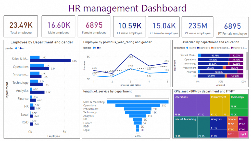
The HR management Dashboard in Power bi is used to track the HR team by analyzing, visualizing data, and take a decision to have a positive impact on the organization. This dashboard can be used to reach the objectives of improving performance management to boosting employee satisfaction.
In this Human resource dashboard we use different types of visualization these are
- Card: This visualization in power bi is used to display the single number data, which is the important thing to track in your power bi dashboard or report. In the financial analysis dashboard example, we use a Card to display the total employee, total male employee, total female employee, total female employee in a full-time and part-time job, and total male employee in full time and a part-time job in the organization.
- Clustered bar chart: This visualization in power bi is used to display the values where the length of the bar or column is proportional to the data. In the HR management Dashboard, we use department on the Axis, gender we use as a legend, and total employee data in values. In this chart, we can visualize the department data on the basis of gender and the total number of employees.
- 100% stacked bar chart: This visualize in power bi desktop is used to display the relative percentage of multiple data series in the stacked bar, whereas the total of each stacked bar always equals 100%. In the HR management dashboard, we use a 100% stacked bar chart to display the data awarded won on the basis of department and education.
- Line Chart: This visualization in power bi is used to represent series of data points connected by a straight line. Also, it is used to represent continuous data. In the HR management dashboard, we use a Line chart to display the employee data on the basis of the previous year’s rating and gender.
- Funnel: In the power bi dashboard this visualization helps to visualize a linear process that has sequential connected stages. In this human resource management dashboard, we use the funnel to display the length of service on the basis of the department.
- Tree-map: The tree map visualization in power bi displays the hierarchical data as a set of nested data. In treemaps, each level of the hierarchy is represented by a colored rectangle which is known as a branch and contains a smaller rectangle called leaves. In the HR management Dashboard, we use treemap to display the data of key performance indicators (KPI) which is greater than 80% on the basis of department and full-time and part-time jobs.
Download Power bi Dashboard (pbix file)

You may like the following Power Bi articles:
- How to combine multiple files from SharePoint folder in Power BI
- Display COVID-19 Power bi report in PowerApps
- How to embed Power bi report in PowerApps portal
- How to display Power bi google analytics in PowerApps
- Power Bi Schedule Refresh
- Power BI waterfall chart
These are the best power bi dashboard examples and also you can download the pbix file and run the dashboard to see how it is appearing.
- Customer Segmentation Dashboard
- Product sales Dashboard
- Sales Analysis Dashboard
- Financial Analytics Dashboard
- Human Resource Management Dashboard

After working for more than 18 years in Microsoft technologies like SharePoint, Microsoft 365, and Power Platform (Power Apps, Power Automate, and Power BI), I thought will share my SharePoint expertise knowledge with the world. Our audiences are from the United States, Canada, the United Kingdom, Australia, New Zealand, etc. For my expertise knowledge and SharePoint tutorials, Microsoft has been awarded a Microsoft SharePoint MVP (12 times). I have also worked in companies like HP, TCS, KPIT, etc.


