This Power BI tutorial explains everything on the Power bi waterfall chart and how to create a chart using Waterfall Visualization in Power BI. Also, we will discuss:
- What is the Power BI Waterfall chart?
- When to use the Power BI Waterfall chart?
- Required data to create a Power BI Waterfall chart?
- How to create a Power BI Waterfall chart using Excel?
- How to create a Power BI Waterfall chart using SharePoint?
- Power BI Waterfall chart sorting
- Formatting of waterfall chart
- Explore data on a Waterfall chart
- Power BI Waterfall chart Slice data
- Power BI Waterfall chart variance
- Power BI Waterfall chart show/hide Total?
- How to show percentage on Power BI Waterfall chart?
- Advantages of the Power BI Waterfall chart
- Disadvantages of the Power BI Waterfall chart
Power BI Waterfall chart
Power BI Waterfall chart is used to plot distributions of numeric data against categorical data. It is powerful custom visuals, that display the positive and negative values contributing to the final total over time.
The Power BI waterfall chart is also known as the Bridge chart. Because we can quickly notice the increase and decrease value as the columns are color-coded. Also, the initial value and the final value columns start on the horizontal axis where the intermediate values are floating columns.
What is the use of Power BI Waterfall chart?
Here we will see what is the use of the Power BI Waterfall chart or why we use this chart.
- It is used to visualize how much money you make and spend, and the running balance for your account.
- Waterfall charts are used to visually represent that how a starting value becomes a final value through a series of intermediate additions and subtractions.
- The additions and subtractions can either be time-based or category-based.
- The waterfall chart most often used in business applications to illustrate the beginning and heading headcount of a year.
- The waterfall chart used to show the changes or variance over the courses of a set of categories.
Read: Microsoft Power bi report vs dashboard
Required data to create a Power BI Waterfall chart
To add data to the Power BI Waterfall chart, we have to add these require fields:
- Category: It represents on Horizontal axis. It specifies the columns that divide the chart.
- Breakdown: It uses to specifies the column that subdivided the details data.
- Values: It used to specify the metric columns that represent the vertical axis.
How to create a Power BI Waterfall chart?
Let us see, how to create a Power BI waterfall chart using excel as well as SharePoint data using Power BI desktop.
Example 1: Create a Power BI Waterfall chart using Excel data
For creating a Power BI Waterfall chart using Excel data we have follow these steps:
Step-1:
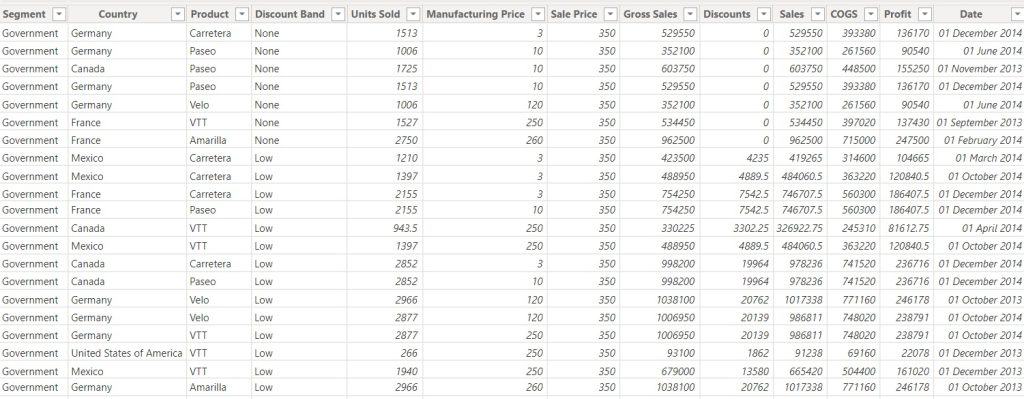
Here we will use a sample excel data that we downloaded from the browser, or you can prepare according to your requirement. You can download it from here.
Step-2:
Go to Power BI Desktop > Get data > Excel > select Excel data > Open.
Step-3:
- After clicking on Open, It will redirect to a navigator page. On which we have to navigate the data from excel to Power BI.
- Select the data, it will reflect on the navigator page.
Step- 4:
Click on Load. The data will be loaded on the Power BI Desktop. We can check it by selecting the Data page section(in the left corner).
Now the data are ready to create the visualization. Go to the Report page section(Upper icon of data section)
Step-5:
Let’s create a waterfall visual from visualizations, which represents the data profit by Product and Year. For this visualization we will take:
- Category: Product
- Breakdown: Year
- Values: Profit
Then the visual will be look like this:
The above visual, it will show the data that basis on product’s profit which breakdowns by the year.
This is how to create a waterfall chart using Excel.
Read: Power BI Export Data
Example 2: Create a Power BI Waterfall chart using SharePoint list
Let us see, how to create a Power BI Waterfall chart using SharePoint Online, follow these steps one by one:
Step-1:
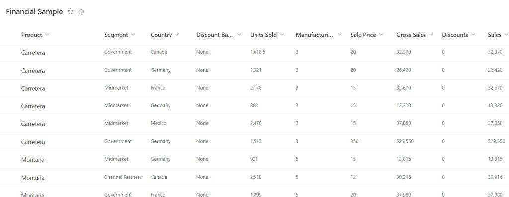
First, we have to Prepare a SharePoint list on which we will create a Power BI Waterfall chart. For example, we created a SharePoint list on Products like this:
Step-2:
Open Power BI Desktop > Get data > More… > Online Services > SharePoint Online List > Connect.
Step-3:
After clicking on Connect it will redirect to a dialogue page, on which we have to enter our SharePoint site URL > OK.
Step-4:
Now a Navigator page will be open. To navigate the SharePoint list on Power BI, select the list> Transform data.
Step-5: By selecting on Transform Data, it will open a Power query editor. Where we can remove unnecessary columns and Format data type.
Here we change Data type of Date column to Date, Title, Customer name, City, Vendor to Text, Quantity, Price, Delivery charges to Whole number. After formatting click on Close & Apply.
Step-6:
It will redirect to the Report page. Now, here we will create a waterfall visual, which represents the data Price by Product and quantity. The fields, we have taken:
- Category: Product
- Breakdown: Quantity
- Values: Price
On this above chart, it showing the product’s price which broken down by Quantity. This is how to create a Waterfall chart using the SharePoint list on Power BI.
Read: Power bi create a date table
Power BI Waterfall chart sorting or Power bi waterfall chart change order
Now we will see how the Power Bi sorts the Waterfall by Products. For shorting, on the top-right corner, select …(More Option).
For this example, select Sort by > choose Product. We can see a yellow indicator, that indicates our selection option is being chosen.
To display Product in ascending order, select Sort ascending. We can see, there is a yellow indicator next to the left of Sort ascending. This indicates that our selected option is applied. Also, we can see the sorting differences between descending and ascending orders.
We can see that, the chart is sorted from Amarilla to VTT for Product.
Read: Power BI Pie Chart
Formatting of waterfall chart
We can make our chart more attractive by formatting it. For formatting follow these steps:
- Select the chart, click on the Format option.
- General: Here we can set the visual position according to co-ordinate of x, y position and set the height and width of the visual.
- Legend: Here we can set the legend title, its position and colors on the visual.
- X-axis: Here we can format the default color, text size of X-axis, font family, padding etc.
- Y-axis: It has the same functionalities as X-axis.
- Data-label: By turning on the data label, we can format the color, Display units to “Auto” or “Thousand”, Orientation to “Vertical” or “Horizontal”, Position to “inside end”, etc. For example, we will format it like this:
- Sentiment colors: Under this, we can change the bar colors of ‘Increase’, ‘decrease’, ‘other’, ‘total’.
- Background: Here, we can format the background color of the visual and can set the transparency. For example, we change the background color white to pink and set its transparency to 52%.
- Title: In this, we can format the title of the visual, font color, size, family and its alignment. For example, we customize the font color Black to Brown, alignment left to center and font size to 17pt.
After applying all the format, the chart will be look like this:
Read: Power Bi line chart
Power bi waterfall chart breakdown
Power BI uses the value in Breakdown, to expose the additional data to the visualization. To expose the data:
Go to Format pane > select Breakdown > set Max Breakdowns to 2. (It will break down the data into 2 segments of the year i.e. 2013 &2014 as we use Year in Breakdown)
If we set Max Breakdown to 1, then a Quick review reveals the profit of the product and year having both negative and positive in the waterfall chart. The data will look like this:
Read: Power Bi key influencers
How to slice data on a Power BI Waterfall chart?
In Power BI, slicer are used to filter a particular dataset from a large data set. Let’s see how to slice data on the Power BI Waterfall chart:
Step-1:
Create a waterfall chart that visualize Sales by Month name. We have taken fields:
- Category: Month Name
- Values: Sales
Step-2:
Select a slicer from visualization. Here we use Month name as Field. Then the both visual will look like:
For example, if we slice the data by a particular month(January), it will show the the details of that selected month data when we do mouse over on that. then the visual will look like this:
Read: Power Bi Bar Chart
Power bi waterfall chart variance
Variance is used to implements a statistical measurement of the spread between numbers in a data set. In Power BI we can evaluate variance by following these easy steps:
Step-1:
Create a Waterfall chart on Power BI. In this example, we create a waterfall chart, which shows the data as Sales by Product and the fields we have taken:
- Category: Product
- Values: Sales
Step-2:
Select the drop-down of the Sales(On value field). Then click on the Variance.
We can see the difference after applying variance on Waterfall chart. The chart will look like below:
We can see various type of statistical measurements are there, like: average, minimum, maximum, median, standard deviation, count… etc.
How to show or hide total on a Power BI Waterfall chart?
This feature is not available on the built-in waterfall chart. So we can download a waterfall visual and perform this show or hide total on Power BI.
- Download Simple Waterfall chart from Get more visuals.
- On that visual, go to Format pane > Define Pillars > Turn off/on Show cumulative Total. This will be apply on the visual.
On this way We can show or hide the Total on Power BI Waterfall chart
Read: Power Bi Pyramid chart
How to show percentage on Power BI Waterfall chart?
There are simple steps by which we can show percentage on our chart :
Step-1:
Create a waterfall chart on Power BI Desktop. For example, here we create a waterfall visual that shows the data as a Profit by-product. We have taken the fields as:
- Category: Product
- Values: Profit
Step-2:
On values field, select the drop-down of Profit > show value as > Percent of grand total.
Then the value will be reflect on the Waterfall chart like below:
This is how to show percentage on Power BI Waterfall chart.
Power bi waterfall chart starting value/Power bi waterfall chart with start and end
Here we will see how to display the starting value and ending value in the Stacked column. For this, we will create a simple data table in Excel like this:
Then import this excel data to Power BI. As the Power BI waterfall visualization currently not providing this function, so we add an index column on that data table. Now the data will look like this:
For this, on Power Query Editor > Add column > Index Column
Now short the column, which we want to put on the category according to index. For example, Column1 sort by column as index.
Now we will use this data on waterfall chart. Then the visual will be look like this:
This is how we can show the starting value and ending value on Power BI water fall chart.
Advantages of Power BI Waterfall chart
Let’s have a look on following advantages of the Power BI Waterfall chart:
- It is very easy to create.
- It does not require any special data preparations.
- It uses a clear structure.
- It is effective to display the gradual changes over time.
- It used to track the performance of a company or business over a given time period.
Disadvantages of Power BI Waterfall chart
Some disadvantages of the Power BI Waterfall chart:
- It has limited options.
- It is not relevant for detailed analysis of the data as you can not expand the data or make the selection in the chart.
You may like the following Power BI articles:
Conclusion
From this above tutorial, we learned these topics about Power BI Waterfall chart:
- What is the Power BI Waterfall chart and why we use this ?
- How to create a Power BI Waterfall chart using Excel?
- How to create a Power BI Waterfall chart using SharePoint?
- How to do sorting and formatting on the Power BI Waterfall chart?
- Explore data on a Waterfall chart?
- How to slice data on the Power BI Waterfall chart?
- How to get variance on Waterfall chart?
- How to show or hide Total on the Power BI Waterfall chart?
- How to show percentage on Power BI Waterfall chart?
- Advantages and disadvantages of the Power BI Waterfall chart?
After working for more than 15 years in Microsoft technologies like SharePoint, Office 365, and Power Platform (Power Apps, Power Automate, and Power BI), I thought will share my SharePoint expertise knowledge with the world. Our audiences are from the United States, Canada, the United Kingdom, Australia, New Zealand, etc. For my expertise knowledge and SharePoint tutorials, Microsoft has been awarded a Microsoft SharePoint MVP (9 times). I have also worked in companies like HP, TCS, KPIT, etc.