
A Power BI report can have perfect data and still fail. If the charts are cluttered, the colors fight each other, and the numbers show seven decimal places, people stop trusting it, or they just stop opening it. Good Power BI visual formatting fixes that and turns a working report into one your managers actually use.
In this guide, I’ll format a real Contoso sales report in Power BI Desktop, step by step: the Format pane, the canvas, report themes, titles, borders, data labels, tables, cards, slicers, number formats, conditional formatting, alignment and accessibility. I’ll also share the checklist and fixes I use on client reports.
Quick answer: Select a visual and open Format visual (the paintbrush icon) in the Visualizations pane. Use the Visual tab for chart-specific settings such as axes, data labels and columns, and the General tab for the title, background, border, shadow and size. For report-wide colors and fonts, use Design > Customize theme.
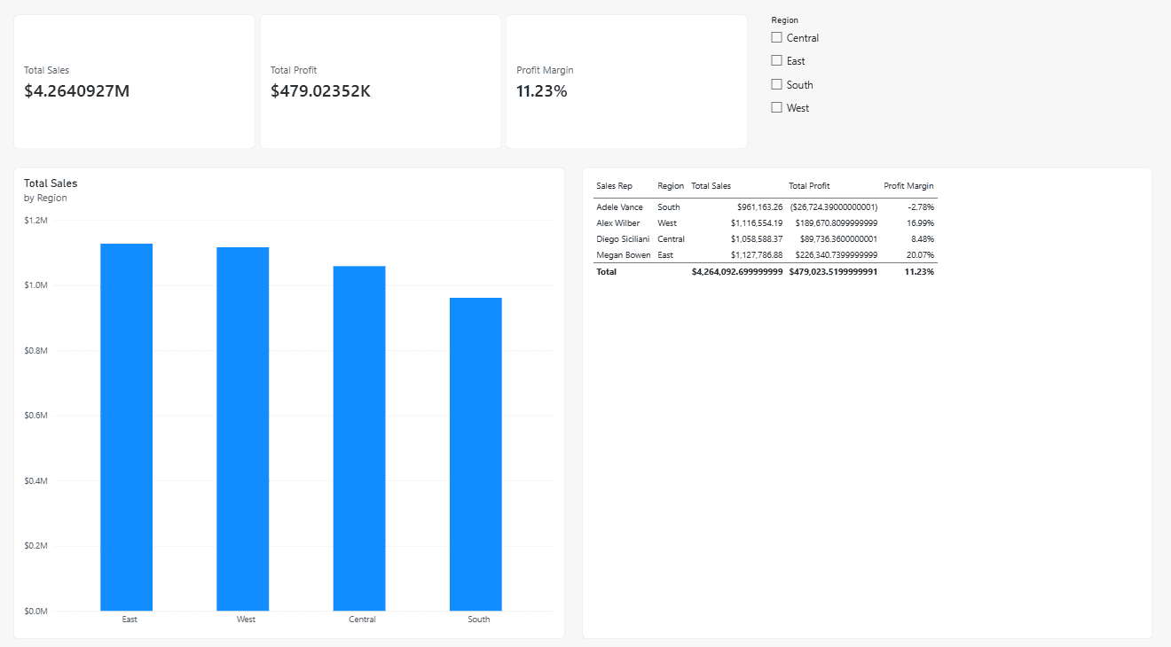
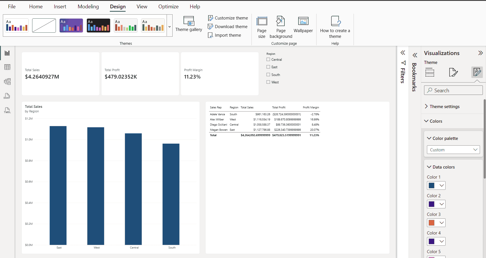
Here’s the sample report before any formatting. The card shows $4.2640927M, the table shows values like $4,264,092.699999999, and every visual uses the default style:
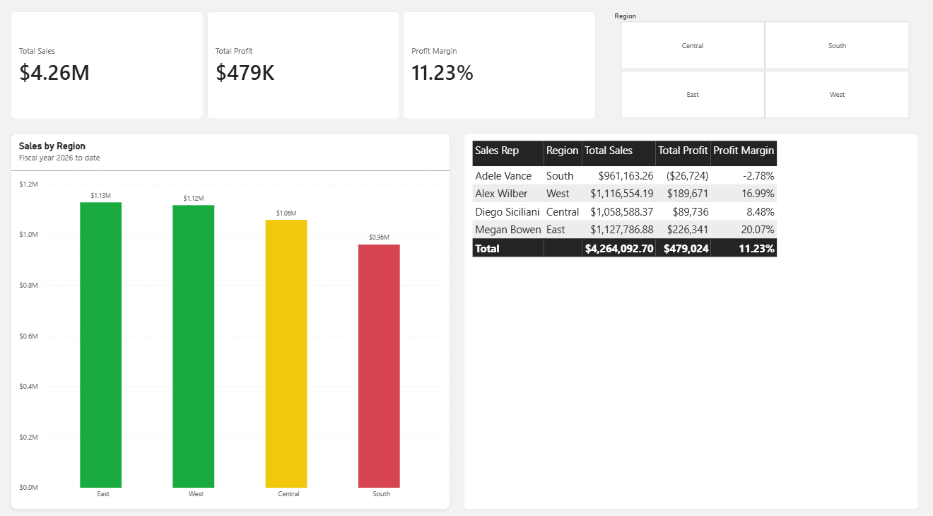
And here’s the same report after the steps in this guide:
What Is Visual Formatting in Power BI?
Visual formatting is everything you change about how a visual looks without changing what data it shows. That includes colors, fonts, titles, axes, legends, data labels, backgrounds, borders, shadows, spacing, number formats and color rules driven by your data.
If you haven’t built a report yet, first create a Power BI report from Excel or SharePoint, then come back here to polish it. Formatting happens at three levels, and picking the right level saves a lot of rework:
| Level | Where you set it | Best for |
|---|---|---|
| Report | Design > Themes | Colors, fonts and default styles for every visual |
| Page | Format pane with no visual selected | Canvas size, page background, wallpaper |
| Visual | Format pane with a visual selected | Titles, axes, labels, borders and one-off changes |
My rule of thumb: set as much as you can at the report level with a theme, then use visual-level formatting only for exceptions.
Where to Find the Format Pane in Power BI Desktop
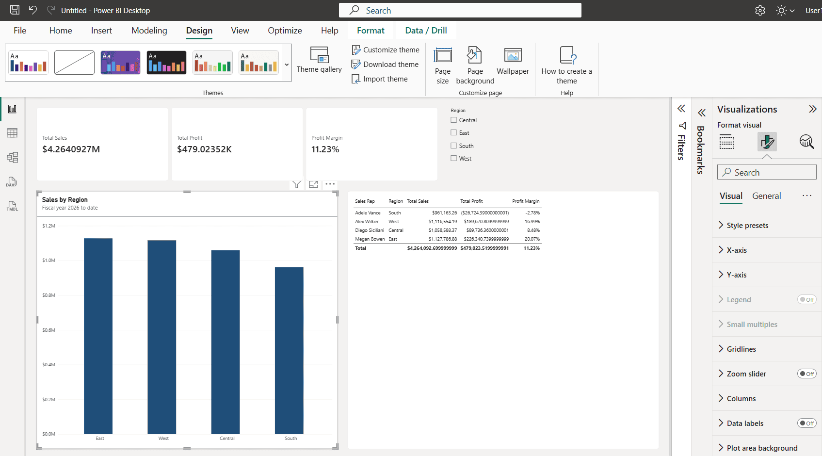
Select any visual on the canvas, open the Visualizations pane on the right and select the Format visual icon (the paintbrush). For this guide, I used a clustered column chart in Power BI that shows Total Sales by Region.
Visual Tab vs. General Tab
- Visual: settings unique to the visual type, such as X-axis, Y-axis, legend, gridlines, columns, data labels and plot area background. A table shows grid, values, column headers and totals instead.
- General: settings every visual shares, such as properties (size, position, padding), title, effects (background, visual border, shadow), header icons, tooltips and alt text.
Search the Format Pane
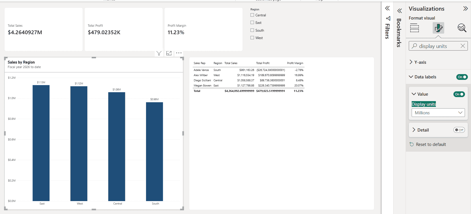
The Format pane has a search box at the top. Type display units, border or style and Power BI shows only the matching cards. It’s the fastest way to find a setting you use once in a while, and it saves scrolling on a small laptop screen.
Start With the Report Canvas (Page Formatting)
Before you touch individual visuals, set up the page. Click an empty spot on the canvas so no visual is selected. The pane now says Format page and shows Page information, Canvas settings, Canvas background, Wallpaper, Filter pane and Filter cards.
Set the Canvas Size
Under Canvas settings, choose a type: 16:9, 4:3, Letter, Tooltip or Custom. In current versions of Power BI Desktop, the default 16:9 page is 1920 x 1080 (Full HD); older reports often use 1280 x 720. Use 16:9 for dashboards viewed on laptops and monitors, and Custom with a taller height for a scrolling report.
Canvas Background and Wallpaper
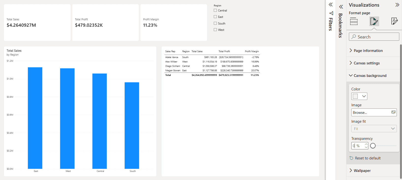
Canvas background controls the color or image inside the page. Wallpaper controls the area outside it. A popular modern look is a light gray canvas (for example #F3F2F1) with white visual backgrounds, so each visual looks like a clean card.
Watch the Transparency slider. When I set #F3F2F1 on my report, the page barely changed until I dragged transparency down to 0%.
Turn On Gridlines and Snap to Grid
On the View tab, check Gridlines and Snap to grid so visuals line up neatly. For exact layouts, set each visual’s size and position under General > Properties.
Apply a Report Theme First (It Saves Hours)
A theme applies colors, fonts and default visual settings to the whole report at once. If you format 30 visuals by hand and your boss then asks for the company colors, you redo all 30. With a theme, you change it once.
Pick a Built-In Theme
In current versions of Power BI Desktop, themes live on the Design tab (older versions had them under View). Select any theme in the Themes gallery to apply it instantly, or open Theme gallery for more options.
Customize the Current Theme
Select Design > Customize theme. Instead of the old dialog box, a Theme pane opens next to the canvas with these sections:
- Theme settings: the theme name and basics.
- Colors: the color palette, data colors (used in charts), structural, sentiment and divergent colors.
- Text: font family, size and color for general text, titles, cards and KPIs, and tab headers.
- Visual properties: default background, border, header and tooltip styles.
- Page, Filter pane and Filter cards: page background, wallpaper and filter pane styling.
I changed Color 1 to Contoso navy (#1F4E79), and every column in the chart updated right away, along with the table header.
Use a JSON Theme File
For full control, select Design > Download theme to save the current theme as a JSON file, edit it, and load it back with Import theme. Here’s a simple starter theme you can copy:
{
  "name": "Contoso Corporate",
  "dataColors": ["#1F4E79", "#12239E", "#E66C37", "#6B007B", "#E044A7", "#744EC2"],
  "background": "#FFFFFF",
  "foreground": "#252423",
  "tableAccent": "#1F4E79",
  "textClasses": {
    "title": { "fontFace": "Segoe UI Semibold", "fontSize": 14, "color": "#252423" },
    "label": { "fontFace": "Segoe UI", "fontSize": 10, "color": "#605E5C" }
  }
}
Save one theme file for your company and share it with every report author. That single file gives you consistent branding across all of your reports.
Format Titles, Backgrounds, Borders, and Shadows (General Tab)
These settings live on the General tab, so they work the same way on almost every visual.
Visual Title, Subtitle, and Divider
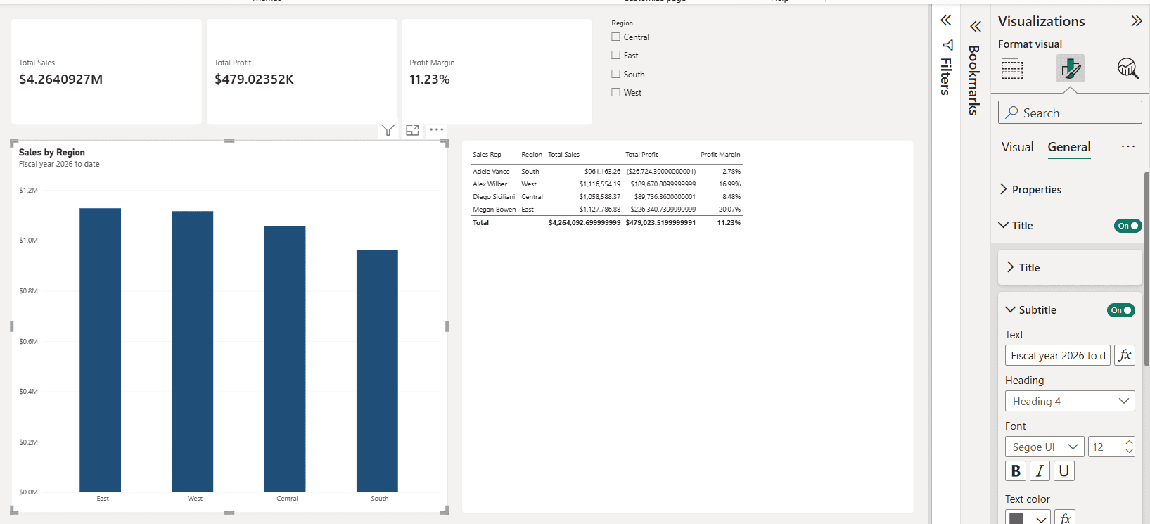
Open Title to change the text, heading level, font, size, color, background and alignment. Replace default titles like “Total Sales by Region” with something a person would say. I used Sales by Region in bold at 16 pt, turned on the subtitle Fiscal year 2026 to date, and switched on the Divider.
Tip: select the fx button next to the title text to build a dynamic title from a measure, for example a title that shows the selected region.
Background, Visual Border, and Rounded Corners
Under Effects > Background, pick a color and transparency. White backgrounds on a light gray page are clean and easy to read. Avoid dark or busy images behind charts, because they make labels hard to read.
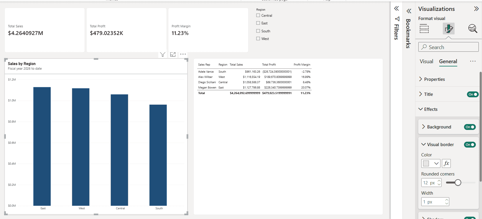
Under Effects > Visual border, set a light color, keep the width at 1 px and set Rounded corners to about 8 to 12 px for a modern card look. I used 12 px. Thick borders pull attention away from the data.
Shadow and Padding
A subtle Shadow (Effects > Shadow) lifts a visual off the page, but use it on all visuals or none. Under Properties > Padding, add a little space so the content doesn’t touch the edges.
Format Chart Elements (Visual Tab)
The Visual tab changes by chart type. For bar, column and line charts, these are the settings you’ll use most. For chart-specific tips, see the guides on the Power BI bar chart and the Power BI line chart.
X-Axis and Y-Axis
You can turn each axis on or off, change its font and set a custom range. Turn off the axis title when the visual title already explains it, and consider hiding Y-axis values when data labels are on.
Gridlines and Legend
Lighten Gridlines to a soft gray or turn them off when data labels are on. Move the legend to the top, and turn it off for single-series charts.
Data Labels
Turn on Data labels to show values right on the chart. Under Value, set Display units to Auto, None, Thousands, Millions, Billions, Trillions or Custom. On my chart, Millions turned $1,127,786.88 into a clean $1.13M.
The Position setting (Inside end, Outside end, Inside center) makes a big difference on column charts. Want values and percentages together? Learn how to show value and percentage in a Power BI bar chart.
Bar, Column, and Line Colors
Under Columns or Bars, change the color for each series or for individual categories. A strong technique is to color everything gray and highlight only the bar that matters. You can also soften bars with rounded corners in a Power BI bar chart. For line charts, adjust stroke width and markers under Lines and Markers.
Format Table and Matrix Visuals
Tables and matrices hold the most detail, so formatting matters even more there. For a deeper walkthrough, read how to format a table visual in Power BI and the Power BI matrix visual guide.
Style Presets, Grid, and Values
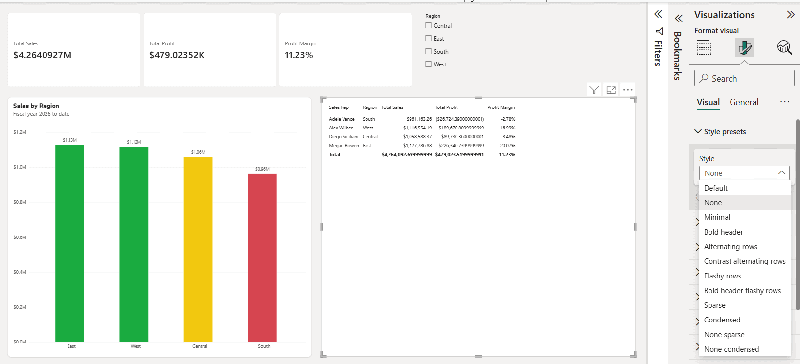
Start with Style presets: Default, None, Minimal, Bold header, Alternating rows, Contrast alternating rows, Flashy rows, Sparse, Condensed and a few more. I picked Alternating rows, then raised the Values font to 16 pt so the table reads well on a 1920 x 1080 page.
Column Headers and Totals
Under Column headers, make the text bold, set a background color and turn on text wrap for long names. Under Totals, make the total row bold so it stands out. If you don’t need it, here’s how to turn off grand totals in a Power BI matrix.
Specific Column Formatting
Specific column formats one column at a time: text color, background, alignment and display units. Right-align numbers and left-align text, and tables look professional instantly. You can also set column width in a Power BI matrix so columns stay consistent.
Format Cards and KPIs
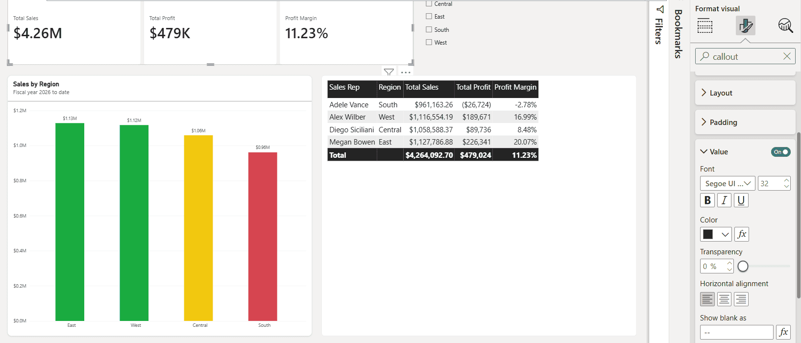
Cards show your headline numbers, so make them big and clear. In the Power BI card visual, open Callout > Value and set the font size; 28 to 36 pt works well. I used 32 pt. The newer card visual shows several measures in one visual, so Total Sales, Total Profit and Profit Margin share one consistent style.
For goal tracking, the Power BI KPI visual adds a trend and a color-coded status. Keep the good and bad colors consistent with the rest of the report.
Format Slicers
Slicers are the first thing users click, so they should look like controls. Select the slicer, then under Slicer settings > Options, set Style to Vertical list, Tile or Dropdown. I switched my Region Power BI slicer to Tile, which works great for four options.
For long lists, a Power BI slicer dropdown saves space. You can also change the header, values font, border and selection controls such as “Select all.”
Number and Date Formatting
Messy numbers are the most common formatting mistake I see. Fix them at the source, and they look right in every visual.
Format Strings in Column and Measure Tools
Select a column or measure in the Data pane, then use the Column tools or Measure tools ribbon to set the format (Currency, Percentage, Whole number and so on), the thousands separator and decimal places. I set Total Sales to Currency with 0 decimals, and the long values in the table became $961,163 and $4,264,093.
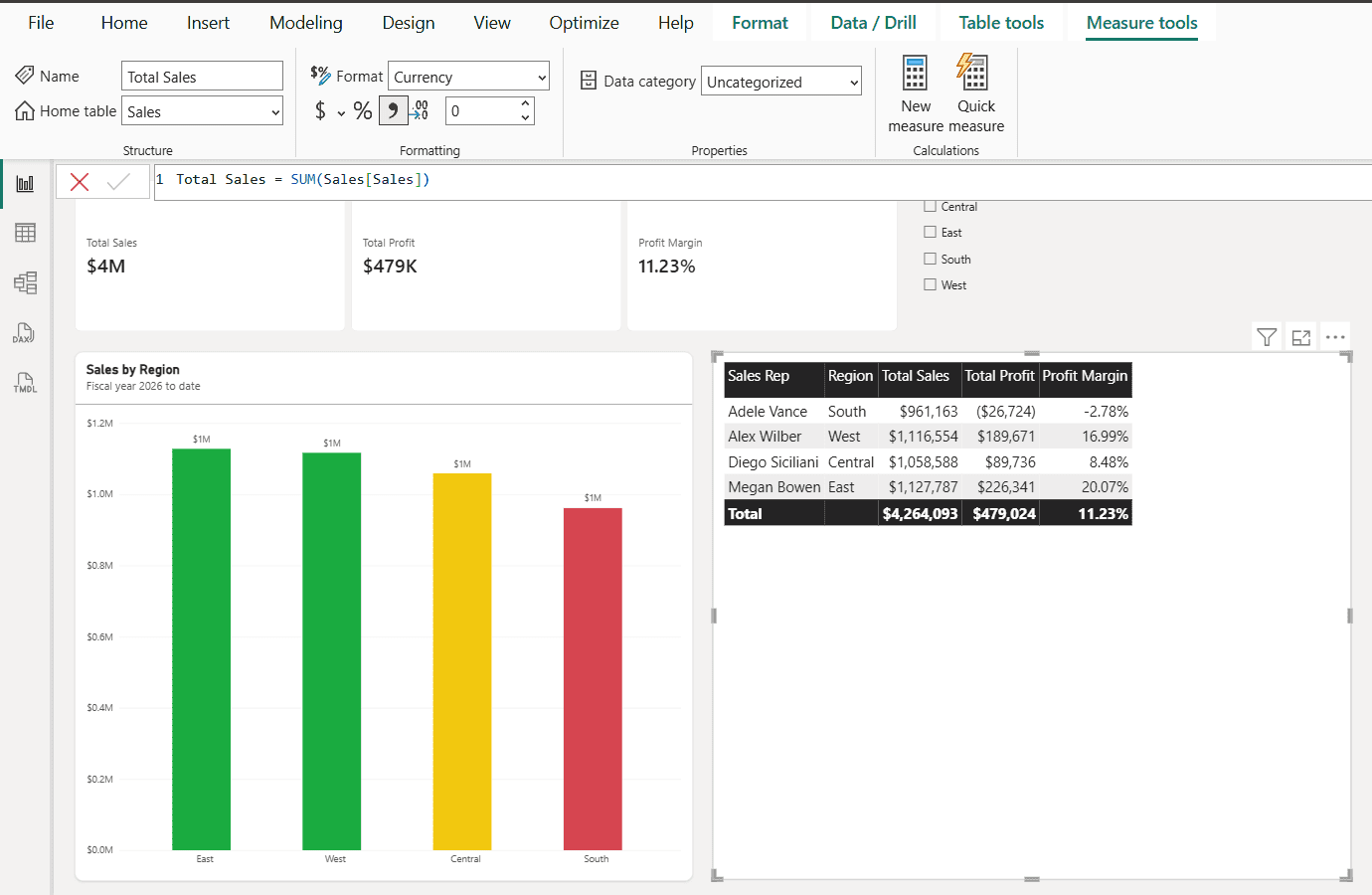
Notice the card showed $4M after that change. Its display units were on Auto, so 0 decimals rounded $4.26 million down. Setting 2 decimal places on the measure gave $4.26M on the card while the table kept full dollar amounts.
Dynamic Format Strings for Measures
Dynamic format strings let one measure change its format based on its value. Select the measure, go to Measure tools > Format, choose Dynamic, switch the formula bar dropdown to Format and enter a DAX expression like this:
SWITCH(
    TRUE(),
    SELECTEDMEASURE() >= 1000000, "$#,0,,.0M",
    SELECTEDMEASURE() >= 1000, "$#,0,.0K",
    "$#,0"
)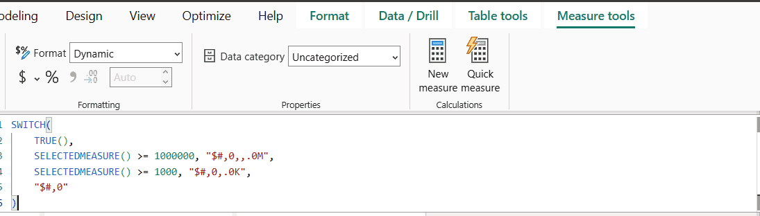
The table then showed $961.2K, $1.1M and a $4.3M total, while the values stayed numeric for sorting. Watch two things. The scaling commas must sit directly left of the decimal point: $#,0.0,,"M" printed $4.3,,MM in my test. And a visual whose display units are set to Auto or Millions scales the value again, so set them to None.
For dates, see this guide on changing the Power BI date format.
Conditional Formatting: Let the Data Pick the Color
Conditional formatting changes colors based on values, so problems jump out. Look for the fx button next to color settings in the Format pane. The full walkthrough is in conditional formatting in Power BI.
| Format style | How it works | Good use case |
|---|---|---|
| Gradient | Colors scale from the lowest to the highest value | Heatmaps in a matrix |
| Rules | If a value is between X and Y, use a color | Red, yellow and green status |
| Field value | A measure returns the color code | Complex business logic |
| Data bars and icons | Bars or icons inside table cells (Cell elements) | Comparing values in a table |
Use a DAX Measure to Control Color
The most flexible option is a measure that returns a hex color, applied with the Field value format style:
Profit Color =
SWITCH(
    TRUE(),
    [Profit Margin] < 0, "#D64550",
    [Profit Margin] < 0.10, "#F2C80F",
    "#1AAB40"
)
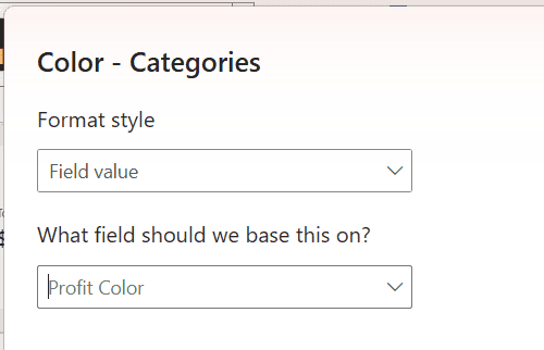
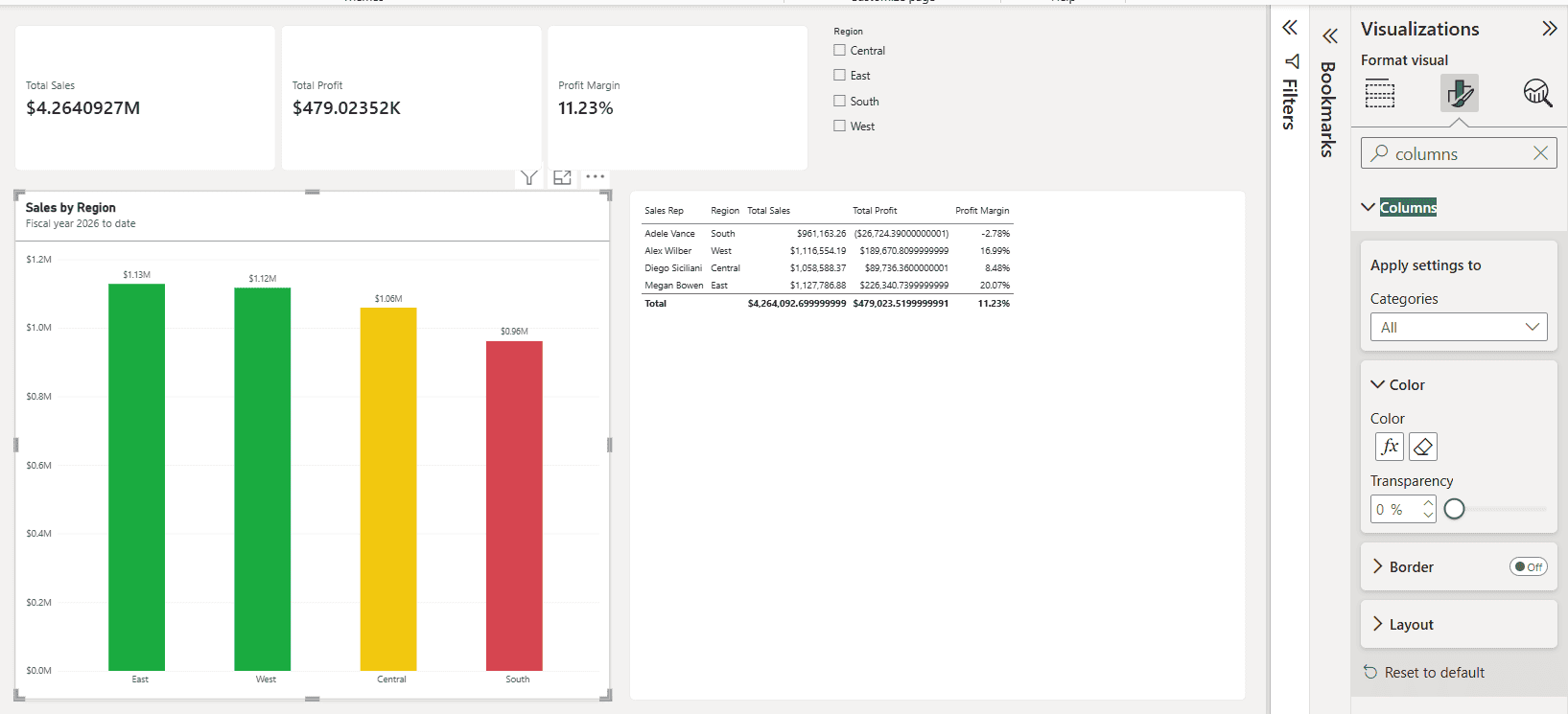
On the column chart, I opened Columns > Color, selected fx, set Format style to Field value and picked Profit Color:
East and West turned green, Central turned yellow at 8.48%, and South turned red because its margin is negative. You can reuse the same measure on cards and table cells, as in this conditional formatting example for a bar chart.
Format Painter, Alignment, and Layering
Copy Formatting With Format Painter
Formatted one visual perfectly? Select it, select Home > Format painter, then click the target visual. Power BI copies the formatting (title, background, border, colors) without touching the data. It works best between visuals of the same type.
Align and Distribute Visuals
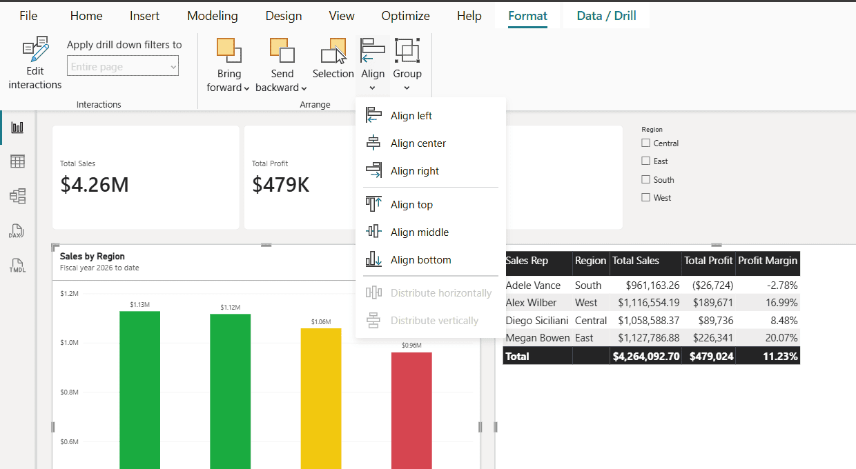
Select several visuals with Ctrl+click, then use Format > Align to align them left, center, right, top, middle or bottom. Distribute horizontally and Distribute vertically need at least three selected visuals; with two, they’re grayed out.
Selection Pane, Grouping, and Locking
Open View > Selection to rename, hide, reorder and group visuals. Group a shape and the visuals on top of it so they move together. When the layout is final, check Lock objects on the View tab so nobody drags things out of place.
Accessibility Formatting Most Reports Skip
An accessible report is simply a better report. Many US organizations, especially in government and education, also require it under Section 508. Check these items before you publish:
- Contrast: text needs a contrast ratio of at least 4.5:1 against its background (the WCAG guideline).
- Don’t rely on color alone: add data labels, icons or markers so color-blind users can read the chart.
- Alt text: fill in General > Alt text for every visual so screen readers can describe it.
- Font size: keep body text at 10 pt or larger and titles at 12 to 16 pt.
Power BI Visual Formatting Best Practices Checklist
Here’s the checklist I run through on every report before I publish it:
| Do | Avoid |
|---|---|
| Use a theme for colors and fonts | Formatting every visual by hand |
| Limit the palette to 3 to 5 colors | Rainbow charts with a new color per bar |
| Use one or two font families | Mixing several fonts and styles |
| Put KPI cards at the top left | Hiding the key number at the bottom |
| Use display units like K and M | Long numbers with many decimals |
| Write plain-language titles | Auto titles like “Sum of Sales by Month” |
| Keep consistent spacing and alignment | Visuals at random sizes and gaps |
| Highlight only what matters | Bold, shadow and borders on everything |
For layout ideas, browse these Power BI dashboard examples.
Common Formatting Problems and How to Fix Them
| Problem | Likely cause | Fix |
|---|---|---|
| Background color doesn’t show | Transparency is at 100% or close to it | Set transparency to 0% |
| Theme change didn’t update a visual | The visual has manual formatting that overrides the theme | Use Reset to default on that visual’s cards |
| Chart shows long decimals | Column or measure format not set | Set the format in Column tools or Measure tools |
| Values show $0.0MM or double suffixes | Display units scale a value that’s already formatted | Set Display units to None in the visual |
| One visual looks different from the rest | Manual changes override the theme | Select Reset to default at the bottom of each card |
| Visual looks different in the Power BI service | Custom font not available in the browser | Use standard fonts like Segoe UI |
If a category with no data is missing from a chart, turn on Show items with no data in Power BI.
Once your visuals look right, these Power BI tutorials help you finish the report:
Frequently Asked Questions
How do I open the Format pane in Power BI?
Select a visual, then select the paintbrush icon (Format visual) in the Visualizations pane. To format the page instead, click an empty area of the canvas first. Microsoft explains every option in its guide to formatting report visualizations.
How do I apply the same formatting to all visuals in Power BI?
Use a report theme: Design > Customize theme, or import a JSON theme file with Design > Import theme. To copy formatting from one visual to another, use Format painter on the Home tab.
Where did the Themes option go in Power BI Desktop?
In current versions, themes are on the Design tab, together with Page size, Page background and Wallpaper. Customize theme now opens a Theme pane next to the canvas instead of a dialog.
How do I change the number format in a Power BI chart?
Set the base format on the column or measure with Column tools or Measure tools. Then, in the visual, adjust Display units and Value decimal places under data labels or the axis.
What’s the difference between conditional formatting and a theme?
A theme sets static default styles for the whole report. Conditional formatting changes colors based on data values, such as turning a negative profit margin red.

I have worked with Microsoft technologies for more than 18 years, including SharePoint, Microsoft 365 and the Power Platform (Power Apps, Power Automate and Power BI), at companies like HP, TCS and KPIT. I started EnjoySharePoint in 2011 to share the solutions I build in real projects with readers in the United States, Canada, the United Kingdom, Australia, New Zealand and beyond. Microsoft has recognized this work with the Microsoft MVP award 13 times since 2014.