
When you click a bar in a Power BI chart, every other visual on the page reacts. Usually that helps. But sometimes a KPI card shouldn’t change, or a pie chart should filter instead of dimming. That’s when you need to edit visual interactions in Power BI.
In this guide, you’ll learn what the three options (Filter, Highlight, and None) do, how to change them in Power BI Desktop and the Power BI service, how to make cross-filtering the default, and how to fix the most common problems. Everything uses the latest Power BI Desktop with on-object interaction turned on.
Quick answer: Select the visual people will click, then go to Format > Edit interactions. Small icons appear on every other visual on the page. Choose Filter (funnel), Highlight (chart icon), or None (circle with a line) on each one, then select Edit interactions again to exit. Changes save right away.
Download the Sample File
Download the sample file: Power-BI-Visual-Interactions-Sample-Data.xlsx (500 rows of US sales data: Region, State, Category, Product, Salesperson, Units, Sales, Profit).
What Are Visual Interactions in Power BI?
Visual interactions control how one visual changes the others on the same report page when you select a data point. For example, clicking West in a “Sales by Region” column chart can filter a table to West-only rows, dim the other regions in a pie chart, or do nothing to a KPI card.
By default, all visuals on a page interact with each other. Editing interactions lets you choose the behavior for each pair of visuals: a source visual (the one you click) and a target visual (the one that responds).
Note: Interactions only affect visuals on the same page. To pass selections across pages, use slicers with Sync slicers or drillthrough.
The Three Interaction Types: Filter, Highlight, and None
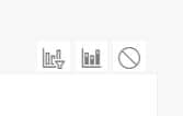
The Edit interactions mode shows up to three small icons on each target visual.
| Option | Icon | What It Does | Best For |
|---|---|---|---|
| Filter | Funnel | Shows only the data related to your selection. Everything else is removed. | Tables, matrices, cards, line charts, details |
| Highlight | Small bar chart | Keeps all the data but bolds the selected part and dims the rest. | Bar, column, pie, donut, and treemap visuals |
| None | Circle with a line through it | The target visual ignores the selection completely. | KPI cards, grand totals, reference charts |
Filter (Cross-Filter)
Filter removes data that doesn’t match. If you click Technology in a category chart, a column chart of sales by region will redraw to show only Technology sales. The axis values can rescale, so it’s great for details but loses the “part of total” context.
Highlight (Cross-Highlight)
Highlight keeps the full bars visible and fills in only the part that matches your selection. You can see Technology’s share of each region compared to the region’s total. This is the default for most charts that support it, and it’s easiest to see on a clustered column chart in Power BI.
None (No Interaction)
None turns the interaction off. Use it for visuals that should always show the full picture, such as a “Total Sales” card, a company-wide target gauge, or a header chart.
Which Visuals Support Which Options?
Not every visual shows all three icons:
- Filter + Highlight + None: Bar and column charts (clustered, stacked, and 100% stacked), pie, donut, and treemap.
- Filter + None only: Line charts, scatter charts, maps (including filled maps and Azure Maps), tables, matrices, cards, KPIs, gauges, and slicers. Microsoft confirms that line charts, scatter charts, and maps can only be cross-filtered, not cross-highlighted. Also, when the source visual is a slicer, every target shows only Filter and None because slicers can only filter.
- Custom visuals: It depends on the developer. Some only support Filter.
How to Edit Visual Interactions in Power BI Desktop (Step by Step)
Load the sample Excel file first so you can follow along.
Step 1: Load the Sample Data
- Open Power BI Desktop.
- On the Home tab, select Excel workbook.
- Browse to Power-BI-Visual-Interactions-Sample-Data.xlsx and select Open.
- In the Navigator, check the SalesData table and select Load.
Step 2: Build a Simple Report Page
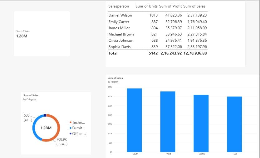
Create four visuals so you can test every interaction type:
- Clustered column chart: X-axis = Region, Y-axis = Sales.
- Donut chart: Legend = Category, Values = Sales.
- Table: Salesperson, Units, Sales, Profit. (See how to create a table in Power BI.)
- Card: Sales (try the new Power BI Card visual).
Step 3: Select the Source Visual
Click the visual whose clicks you want to control. In this example, select the Sales by Region column chart.
Step 4: Turn On Edit Interactions
- Go to the Format tab on the ribbon. (It appears only when a visual is selected.)
- In the Interactions group, select Edit interactions.
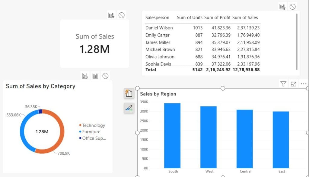
The button stays highlighted while the mode is on, and icons appear on every other visual on the page.
Step 5: Choose Filter, Highlight, or None for Each Target Visual
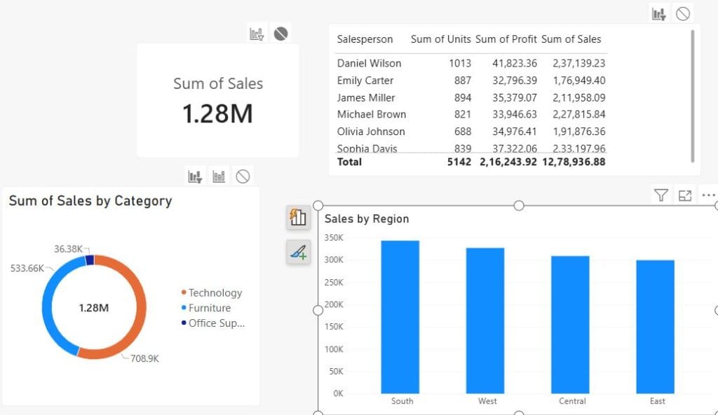
Look at the icons on the top-right corner of each other visual. The selected one is dark; the others are gray.
- On the Donut chart, select Filter (funnel icon).
- On the Table, keep Filter.
- On the Card, select None so total sales never changes.
Changes are saved immediately. There’s no Apply button.
Step 6: Repeat for Other Source Visuals
Interactions go one way. Setting the column chart to filter the donut doesn’t set the donut to filter the column chart. Select the Donut chart as the new source (while Edit interactions is still on) and set its icons on the other visuals.
Step 7: Turn Off Edit Interactions and Test
- Select Format > Edit interactions again to exit the mode.
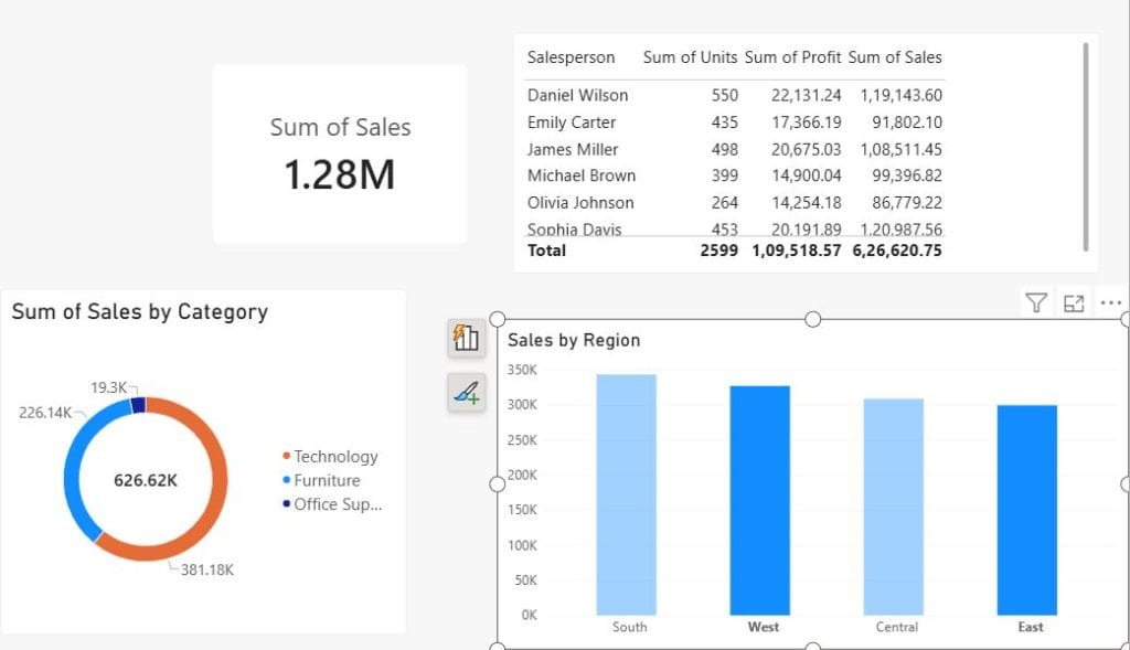
- Click West in the column chart. The donut filters, the table filters, and the card stays at the full total.
- Click an empty area of the chart (or the selected bar again) to clear the selection.
Tip: Hold Ctrl and click multiple data points to select more than one value, such as West and East together.
How to Edit Visual Interactions in the Power BI Service
You can also change interactions in a published report if you have edit permission in the workspace.
- Open the report in the Power BI service (app.powerbi.com).
- Select Edit on the action bar.
- Select the source visual.
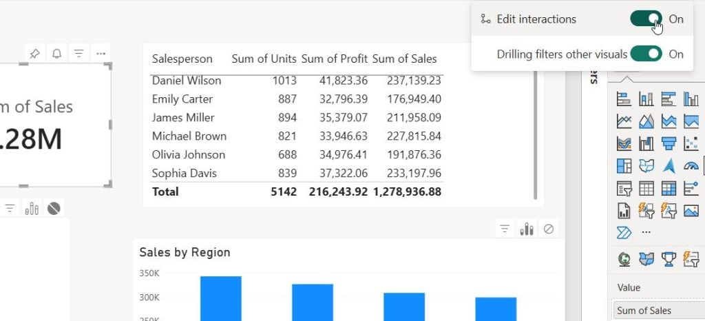
- In the report menu bar, select Visual interactions and turn on the Edit interactions toggle.
- Choose Filter, Highlight, or None on each target visual.
- Turn off Edit interactions, then select Save.
Note: Report readers (View mode) can’t change interactions. They can only use the behavior you set. If you’re sharing pages with leaders, see how to create a dashboard in Power BI.
How to Change the Default from Cross-Highlight to Cross-Filter
If you prefer Filter everywhere, don’t change every visual by hand. Change the report default instead:
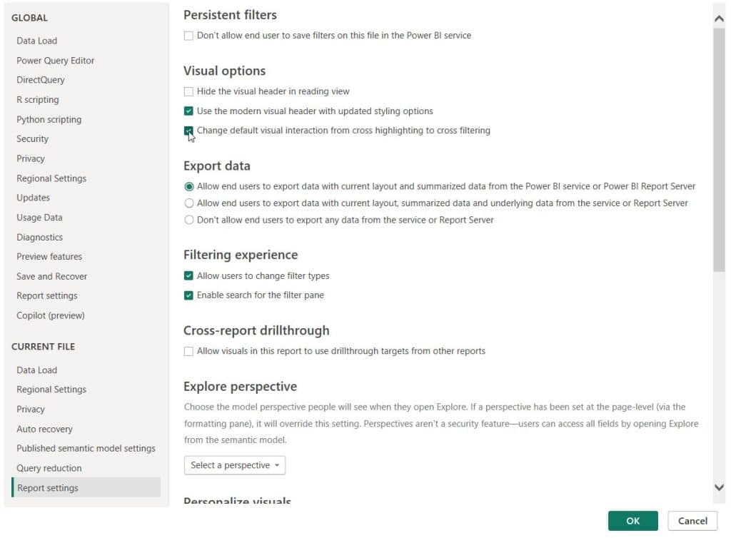
- In Power BI Desktop, go to File > Options and settings > Options.
- Under CURRENT FILE, select Report settings.
- In the Visual interactions section, check Change default visual interaction from cross highlighting to cross filtering.
- Select OK.
This setting applies to the current report only. Any interactions you’ve already set by hand stay the same.
How Drilling Affects Visual Interactions
When a chart has a hierarchy (like Region > State), drilling down can also filter the rest of the page. If you haven’t built one yet, here’s how to create a hierarchy in Power BI.
- Select the visual with the hierarchy.
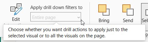
- Turn on drill mode, then on the Format tab, open Apply drill down filters to and select Entire page. (In the Power BI service, use Visual interactions > Drilling filters other visuals = On.)
With this set, drilling into West filters other visuals to West. With the default setting, drilling only changes the chart you drilled into.
Tip: Drillthrough pages work differently. They use drillthrough fields, not the Edit interactions settings.
Real-World Examples: When to Use Each Interaction
Example 1: Keep KPI Cards Static
Your executive dashboard shows Total Sales and Total Profit cards at the top. Set every source visual to None on these cards so leaders always see company-wide totals.
Example 2: Show Share of Total with Highlight
A stacked column chart of Sales by Region should show how much Furniture contributes to each region. Keep Highlight so the full bar stays visible and the Furniture portion stands out.
Example 3: Detail Tables with Filter
A table visual lists orders. When a user clicks Texas on a map, the table should show only Texas orders. Use Filter.
Example 4: Slicers That Shouldn’t Affect a Benchmark Chart
You have a Year slicer, but one Power BI line chart compares all years. Select the slicer, turn on Edit interactions, and set the line chart to None.
Troubleshooting: Common Visual Interaction Problems
| Problem | Cause | Fix |
|---|---|---|
| Edit interactions is grayed out | No visual is selected, or the page has only one visual | Select a visual first; add a second visual |
| No Highlight icon on a visual | The target is a table, card, line, scatter, or map visual, or the source is a slicer | Use Filter or None |
| Clicking a chart doesn’t change another visual | Interaction is set to None | Turn on Edit interactions and select Filter or Highlight |
| Visuals filter but shouldn’t | Default interactions are on | Set the target to None |
| Filter shows blank or wrong values | No relationship between the tables in the model | Create a relationship in Model view |
| Changes aren’t visible in the service | Report wasn’t republished or saved | Publish from Desktop again or select Save in the service |
| Groups don’t behave as expected | Grouped visuals keep individual interaction settings | Set interactions per visual inside the group |
Best Practices for Power BI Visual Interactions
- Plan before building. Decide which visuals are “drivers” (things users click) and which are “outputs.”
- Set KPI cards to None when they show overall totals.
- Use Highlight for comparison charts and Filter for detail visuals.
- Limit cross-filtering on busy pages. Every click sends queries for each filtered visual, which can slow large models.
- Tell users what happens. Add a short text box like “Click a region to filter the table.”
- Test in the service and on mobile after you publish.
- Check accessibility. Highlight relies on color contrast; make sure dimmed values are still readable. Use conditional formatting carefully.
For more Power BI and Microsoft 365 tutorials, browse the Power BI tutorials on EnjoySharePoint.
Conclusion
Learning to edit visual interactions in Power BI is one of the quickest ways to make your reports clearer. Use Filter for detail visuals, Highlight to show share of total, and None for KPIs that should never change. If you prefer filtering everywhere, change the default in Report settings.
Download the sample Excel file, build the four-visual page, and try each option yourself.
Want to keep improving your report pages? These tutorials are a good next step:
Frequently Asked Questions
1. Where is Edit interactions in Power BI Desktop?
Select a visual, then go to the Format tab on the ribbon and select Edit interactions in the Interactions group. The Format tab appears only when a visual is selected. Change how visuals interact in a Power BI report.
2. What is the difference between cross-filter and cross-highlight in Power BI?
Cross-filter (Filter) removes data that doesn’t match the selection. Cross-highlight (Highlight) keeps all data but dims the unmatched parts, so you can still see the share of total.
3. How do I stop one visual from filtering another in Power BI?
Select the source visual, turn on Format > Edit interactions, and select the None icon on the target visual.
4. Why is the Highlight option missing on my visual?
Line charts, scatter charts, maps, tables, matrices, cards, KPIs, gauges, and slicers can only be cross-filtered, so they show only Filter and None. Also, if the selected (source) visual is a slicer, every target shows only Filter and None.
5. Can I set Filter as the default interaction for all visuals?
Yes. Go to File > Options and settings > Options > Report settings, and check Change default visual interaction from cross highlighting to cross filtering.
6. Do visual interactions work across report pages?
No. They only work on the same page. Use synced slicers or drillthrough to pass filters to other pages.
7. Can I edit visual interactions in the Power BI service?
Yes. Open the report, select Edit, select a visual, then select Visual interactions and turn on Edit interactions. You need edit permission.
8. Can report viewers change visual interactions?
No. Only report authors in edit mode can change them. Viewers can clear selections, but they can’t change Filter, Highlight, or None.
9. Do slicers follow Edit interactions settings?
Yes. Select the slicer, turn on Edit interactions, and set any visual to None to ignore that slicer.
10. How do I make drill-down filter other visuals?
In Power BI Desktop, select the visual, then go to Format > Apply drill down filters to > Entire page. In the Power BI service, use Visual interactions > Drilling filters other visuals.

I have worked with Microsoft technologies for more than 18 years, including SharePoint, Microsoft 365 and the Power Platform (Power Apps, Power Automate and Power BI), at companies like HP, TCS and KPIT. I started EnjoySharePoint in 2011 to share the solutions I build in real projects with readers in the United States, Canada, the United Kingdom, Australia, New Zealand and beyond. Microsoft has recognized this work with the Microsoft MVP award 13 times since 2014.