Collabion Charts for SharePoint
Charts are critical to understanding an organization’s business data efficiently. Graphs or charts help people understand data quickly, and it will make information visually attractive to the audience.
Organizations using SharePoint to improve their productivity maintain a fair amount of business data. Business users in such organizations love to see data in the form of charts in SharePoint.
Though SharePoint provides few options to show data in graphs or charts like SQL Server Reporting Services, PowerPivot, and PerformancePoint, the problem with these things is that it requires explicit SharePoint development knowledge and dedicated time.
There are no such web parts in SharePoint that can show us charts from SharePoint list data or any other data sources. There are lots of business users (Power users in SharePoint) who want to see the data in graphical representation instantly.
To overcome the issues, Collabion provides a powerful dashboarding and charting tool called ‘Collabion Charts for SharePoint’ using which you can create great dashboards in the form of charts and graphs from data stored in SharePoint lists and views without writing a single line of code.
Features of Collabion Charts for SharePoint
Here are few features of Collabion Charts for SharePoint:
- Collabion resides as a web-part in your SharePoint environment and is hence easy to get started as and when required.
- Collabion Charts works in all major versions of SharePoint on premise. It works very well with SharePoint 2016/2013/2010.
- To use Collabion charts you do not need Excel Services or PerformancePoint. Collabion is a 100% code-free product geared towards all business users of SharePoint.
- Not just with SharePoint list as a data source, but you can also connect to CSV, Microsoft SQL Server, Oracle, Excel, ODBC and BDC.
- It provides as much as 56 chart types with a combination of 2D and 3D charts. These include Column Charts, Bar Charts, Spline, Multi-series, Bubble (X-Y-Z chart) charts, Scroll Column 2D, among others.
- Built on top of JavaScript (HTML 5), Collabion Charts works very well with all major browsers as well as devices like iPhones and iPads.
- Another beauty of Collabion Charts for SharePoint is that all charts can be exported as Excel Charts, Images or PDF for offline use and these charts can be printed.
- The charts are highly interactive with tooltips, drill-downs, multi-level drill-downs, selective display of data, automatic chart refresh, etc. enabling a rich user experience.
- Collabion charts also support a host of filtering and grouping options.
- It accommodates various fonts, colors and other visual effects.
Installation of Collabion Charts for SharePoint
Collabion Charts for SharePoint supports SharePoint 2016, SharePoint 2013 (both foundation and server version) as well as SharePoint 2010 (both foundation and server version).
Download the setup file from the official Collabion website and then follow a simple wizard-style installation, which will install on the SharePoint server. You can also upgrade to an updated version using the same approach. You can follow the steps as mentioned here to get this done faster.
Configuring Collabion Charts in SharePoint
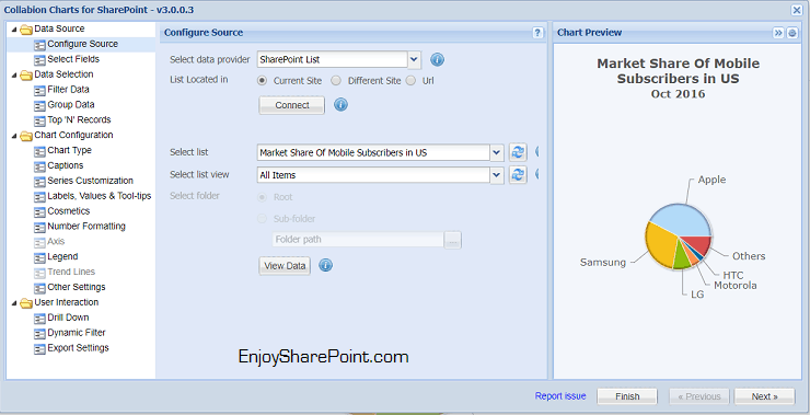
Here, I am using Collabion’s demo environment for configuring the charts. The demo environment is impressive where you can check out all features directly from the browser. The data source, for our reference, will be a sample SharePoint list which is storing information about mobile subscribers in the US. The chart will appear like below and let us see how we can configure it.

You can configure any chart by just clicking on the ‘Edit this chart’ link. It will open a Chart configuration dialog where you need to set a chart to appear. The configuration looks so native to SharePoint that you’ll not feel you are using a third-party product.
Choosing the Data Source:
Collabion supports various data sources which you can choose from Data Source -> Configure Data Source section. You can get data from the current site, different site and also from a specific URL.
Then you can select the list from which you want to the data. A cool thing here is that as we know we create lots of views for a file: Collabion allows you to select a particular view.
Live Preview:
Another beauty of Collabion Charts is that you can see the live preview in the configuration dialog box.

Select Fields for Chart:
You can easily choose what all fields you want to display in the chart. You might not need to show all the areas in the chart.

Filter Data:
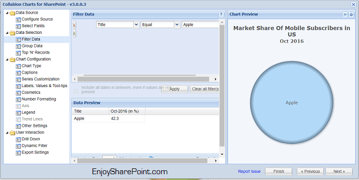
You can filter the data to show in the chart on the go. Here I have added one filter to display data for Title as ‘Apple,’ and you can see how my chart will appear in the Chart preview.

Chart Configurations:
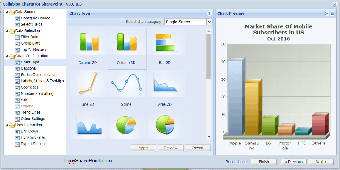
In the chart type, you can choose from over 50 chart types. Just select a chart type and click on the preview button to see how the chart will appear in real time. You can check I have chosen the chart type as Column 3D and this is how the chart will look.

Chart Captions:
You can easily give a title, the subtitle for a chart from the Captions screen. You can also provide X-axis or Y-axis titles very quickly. Your organization’s business users can change the title anytime without any dependency.

Easily Set Tooltips:
Tooltips are helpful to get some more information about a column, bar, pie slice, etc. You can also set the background color, border color, etc.

Cosmetic Changes:
You can quickly do few cosmetic changes like the font (you can choose from 6 fonts), margin & padding, the background color for the chart. You can also put the logo on a chart.

Other Settings:
You can show various pre-defined messages to the user if a chart is loading, data is loading, or you can show a message while the information is processing, etc.

Export Settings:
Another useful feature is the Export Settings section. You can enable the chart to export a PowerPoint presentation, Excel Spreadsheet, or to a PDF if you want to enable printing. The export feature is so extraordinary, your business people can download a PowerPoint presentation and can present it directly.

Chart Data Source (SQL Server):
You can select the data source as Microsoft SQL Server as well. The configuration is so simple; you just need to choose the provider as Microsoft SQL Server Database and then provide the server name, database name, authentication, etc.
You can display data from a table, view or even from a SQL query.

Collabion Dashboards
I am using Collabion’s demo environment for dashboards and charts, and the demo environment is impressive where you can check out all features directly from the browser itself.
You can create a beautiful dashboard page by adding and configuring Collabion chart web parts. We can see a sample dashboard of a Sales team of Fresh Forks. There are 3 chart web parts, where you can see different stats. Each chart has a tooltip that shows more information.

Each chart supports filters. Also, you can see how we can filter based on drop-down values.

Export Chart as PDF/PPT/PNG/JPG/Excel

Another beauty of these charts are, every chart can be exported to .png, .jpg, .pdf, excel document, PowerPoint presentation format by merely using a few clicks. Just click on the export icon and choose the export option. So simple and easy to export in pdf format. You can also click Print option to print the chart.
View data with the powerful drill-down
The chart is very interactive. I can click on the year 2012 in the above chart and can see the whole year’s data month-wise in an interactive chart like below:

Similarly, I can click on any month, and I can look at the details for the particular month in another chart like below:

Multi-Level Drill-Down in Collabion
The drill-down feature is fascinating where you can navigate to drive deeper inside. In an example, you can see sales chart for Continent -> Country -> then City. The breadcrumb at the bottom of the chart shows the path you navigated. At any point of time, click the Back button at the upper right corner or the breadcrumb links to go back to the previous level.

Conclusion
Collabion Charts for SharePoint is a handy third-party tool for creating charts and dashboards in your SharePoint environment. You can create amazing charts merely with a few clicks in your browser. The multi-level drill-down feature is something I’ve fallen in love with and is a very powerful feature for organizations having critical data. This fantastic tool also supports various data sources which make the use case very strong. I strongly recommend Collabion Charts for SharePoint. You can check out their multiple charts demos or download their 30-day fully functional free trial here to try for yourself!
You may like the following SharePoint product reviews:
- Office 365 Calendar Add-in by Virto Software Product Review
- KWizCom Forms Enterprise Edition Product Review
- Infowise Ultimate forms SharePoint Product Review
- Datapolis Process System for SharePoint 2013 Product Review
- DocRead for SharePoint Review (Collaboris)
- LepideMigrator for Documents Product Review (Kernel Migrator for SharePoint)
- Harmon.ie Mobile iOS product review for iPhone and iPod
- Netwrix Auditor for SharePoint

After working for more than 18 years in Microsoft technologies like SharePoint, Microsoft 365, and Power Platform (Power Apps, Power Automate, and Power BI), I thought will share my SharePoint expertise knowledge with the world. Our audiences are from the United States, Canada, the United Kingdom, Australia, New Zealand, etc. For my expertise knowledge and SharePoint tutorials, Microsoft has been awarded a Microsoft SharePoint MVP (12 times). I have also worked in companies like HP, TCS, KPIT, etc.


