
Every retail or finance report I’ve built eventually hits the same request: “Can you show me total sales by region and product category, together?” A sales manager doesn’t just want one total — they want the numbers broken down by two, sometimes three, columns at once. That’s exactly where grouping and summing by multiple columns in Power BI becomes essential.
If you’ve only worked with a single grouping column so far, adding a second or third one can feel confusing at first. Should you use a visual? A Power Query step? A DAX measure? The honest answer is: it depends on what you’re building and where the summarized data needs to live. In this guide, I’ll walk you through all three practical methods, using a sales dashboard for a mid-sized retail company as our running example, so you can pick the right approach for your own report.
By the end of this tutorial, you’ll know exactly how to group by multiple columns and sum values correctly, whether you need it in a visual, in your data model, or as a reusable measure.
Why Grouping by Multiple Columns Matters
Before jumping into steps, it helps to understand why this comes up so often. A single table of raw transaction data — say, one row per order — isn’t useful on its own. Business users want summarized views: total sales by Region and Product Category, total headcount by Department and Location, or total expenses by Cost Center and Month.
Grouping by multiple columns means you combine two or more fields into one summarized view, then apply an aggregation like SUM on top of it. Power BI gives you three main ways to do this:
| Method | Best For | Where It Lives |
|---|---|---|
| Matrix or Table visual | Quick, on-the-fly grouping in a report | Report canvas only |
| Group By in Power Query | Pre-aggregating data before loading | Data model (as a new table) |
| DAX measure with SUMX/CALCULATE | Dynamic, reusable calculations | Data model (as a measure) |
Each method has trade-offs. Let’s go through them one by one.
Method 1: Group By Multiple Columns Using the Matrix Visual
This is the fastest method, and it’s the one I reach for first when a stakeholder just wants to see the grouped totals without changing the underlying data.
Step 1: Load your data. Import your sales table into Power BI Desktop from Excel, SQL Server, or SharePoint. Our example table has columns like OrderDate, Region, ProductCategory, and SalesAmount.
Step 2: Add a Matrix visual. A Matrix is a visual that behaves like a pivot table — it lets you stack multiple fields into rows or columns and automatically aggregates the values. Click on the Matrix icon in the Visualizations pane.
Step 3: Add multiple fields to Rows. Drag Region into the Rows field well, then drag ProductCategory right below it. Power BI automatically nests the second column under the first, giving you a hierarchy — Region at the top level, Product Category inside each region.
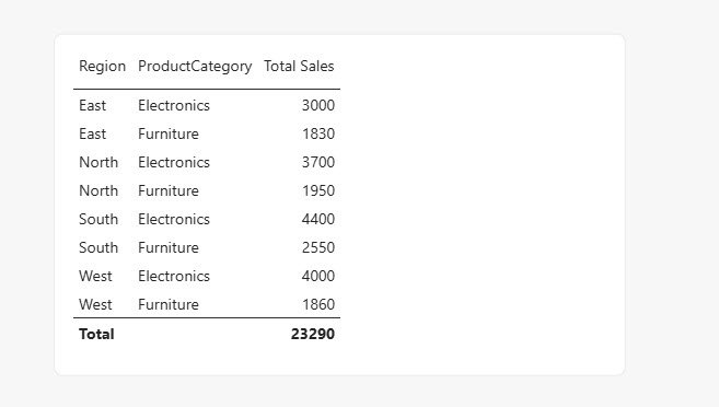
Step 4: Add the value field. Drag SalesAmount into the Values field well. By default, Power BI sums numeric fields, so you’ll immediately see totals broken down by both columns.
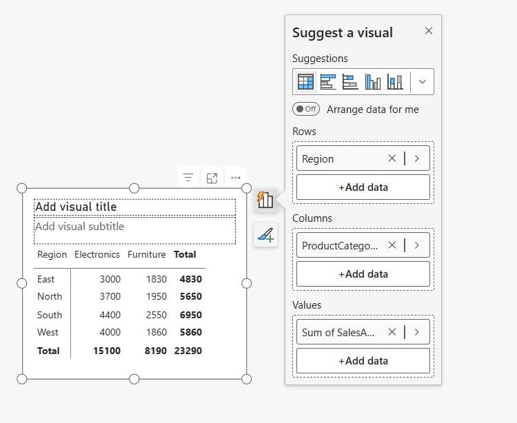
Step 5: Turn on subtotals if needed. Right-click the Matrix visual, go to Format your visual > Row headers, and toggle Subtotals on. This gives you a total per region, in addition to the region-and-category breakdown.
If you want more control over how those totals display, I’d recommend reading through this guide on the Power BI matrix visual — it covers formatting options that aren’t obvious at first glance. You can also learn to calculate percentage of total in a matrix once your grouped sums are in place, which is a common next request from managers.
Pro Tip: I’ve found that clients almost always ask for a third grouping level a week after the first version goes live. Build your Matrix with that in mind — add
Region,ProductCategory, and leave room to drop inSalesReporMonthlater without redesigning the whole visual.
Using a Table Visual Instead
If you don’t need the collapsible hierarchy that a Matrix gives you, a flat Table visual also groups by multiple columns — it just won’t nest them. Drag Region, ProductCategory, and SalesAmount all into the Values area, and Power BI groups by the two text columns automatically, summing the numeric one. I generally prefer the Table when the audience wants to export the data or scan it in one flat list.
Method 2: Group By Multiple Columns in Power Query
Sometimes you don’t want the grouping to happen only inside a visual — you want a genuinely summarized table in your data model, maybe to speed up performance or to feed a separate report. That’s where Power Query‘s Group By feature comes in.
Power Query is Power BI’s data preparation tool — it’s where you clean, reshape, and transform data before it loads into your model.
Step 1: Open Power Query Editor. Click Transform data on the Home ribbon in Power BI Desktop.
Step 2: Select your table. Click on your sales table in the Queries pane.
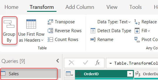
Step 3: Click Group By. On the Home ribbon, click Group By. A dialog box opens.
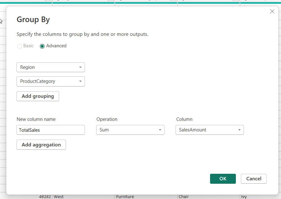
Step 4: Choose Advanced mode. Click Advanced at the top of the dialog — this lets you group by more than one column.
Step 5: Add your grouping columns. Click Add grouping and select Region. Click Add grouping again and select ProductCategory.
Step 6: Define the aggregation. Under “New column name,” type something like TotalSales. Set the Operation to Sum, and choose SalesAmount as the column to aggregate. You can click Add aggregation to add a second calculation, like Count Rows, if you also want order counts per group.
Step 7: Click OK, then Close & Apply. Power BI creates a new, condensed table with one row per Region-Category combination and the summed totals.
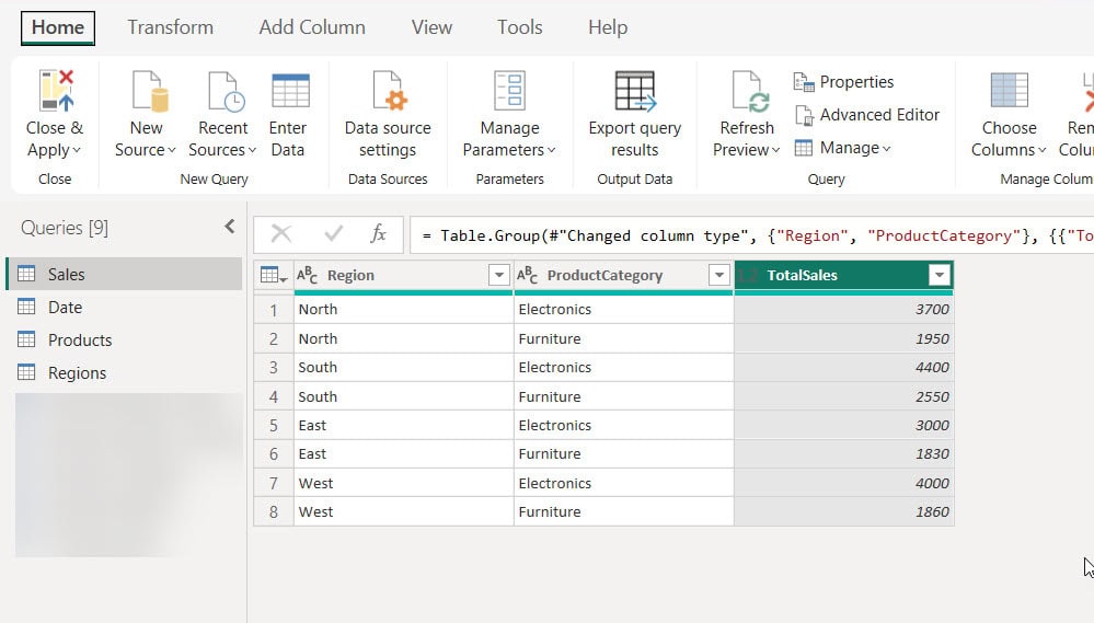
This method genuinely changes your data — the detailed rows disappear from this specific query, replaced by summary rows. I only use it when I need a lightweight summary table for a specific visual or export, not as my main fact table.
If your source data is still messy before you get to this step — inconsistent categories, duplicate spellings, missing values — it’s worth comparing Power Query vs Power BI first to understand where transformation should happen versus where reporting logic belongs.
Pro Tip: In my experience, grouping in Power Query is a one-way street inside that query. If you group too early, you lose the ability to drill into individual transactions later. Keep your original detailed table intact and create a duplicate query for the grouped version — right-click the query and choose “Duplicate” before applying Group By.
Method 3: Group By Multiple Columns Using DAX Measures
This is the method I use most often for dashboards that need to stay dynamic — where filters, slicers, and drill-downs must keep working. A measure is a calculation that computes a result on the fly, based on whatever filters are currently applied in the report, unlike a static grouped table.
Step 1: Create a basic Total Sales measure. Go to the Data pane, right-click your sales table, and select New measure. Type:
Total Sales = SUM(Sales[SalesAmount])
This measure just adds up the SalesAmount column. It doesn’t care about grouping on its own — the grouping happens automatically based on whatever columns you place in your visual.
Step 2: Drop the measure into a Matrix or Table. Add Region and ProductCategory to Rows, and add your Total Sales measure to Values. Power BI applies filter context — meaning the measure recalculates separately for every Region-Category combination shown in the visual. This is fundamentally different from Power Query’s Group By, which pre-computes a fixed result.
Step 3: Build a measure for a specific grouped total using CALCULATE. Sometimes you need the sum for one specific group, regardless of what’s shown elsewhere. For example, total sales just for the “Electronics” category across all regions:
Electronics Sales = CALCULATE(SUM(Sales[SalesAmount]), Sales[ProductCategory] = "Electronics")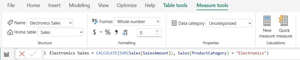
CALCULATE changes the filter context of a calculation — here, it forces the SUM to only consider rows where ProductCategory equals “Electronics,” no matter what other filters are active.
Step 4: Use SUMX for row-by-row grouped calculations. If your sum depends on a calculation done row-by-row before aggregating (for example, Quantity * UnitPrice when you don’t have a pre-calculated sales column), use SUMX:
Total Revenue = SUMX(Sales, Sales[Quantity] * Sales[UnitPrice])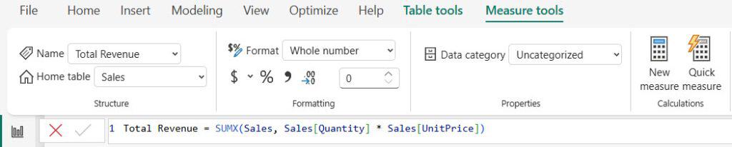
SUMX is an iterator function — it goes through each row in the table, multiplies quantity by price, then adds up all those row results. This works correctly no matter how many columns you group by in your visual, because it recalculates for each group.
For a deeper comparison of when to use SUM versus SUMX, I’d point you toward this breakdown of Power BI DAX SUM vs SUMX — it’s a distinction that trips up a lot of people building their first measures. And if you’re still getting comfortable writing measures generally, start with how to create a measure in Power BI before tackling multi-column grouping logic.
Pro Tip: I’ve seen teams build a separate measure for every single grouping combination — one for Region only, one for Category only, one for both. You almost never need that. Write one solid
Total Sales = SUM(...)measure, and let the visual’s row and column fields do the grouping work for you.
Grouping by Multiple Columns Using GROUPBY and SUMMARIZE (Calculated Tables)
If you need a genuinely new table inside your data model — not just a visual, and not a Power Query transformation — you can build one with DAX. Right-click your table in the Data pane and choose New table, then write:
RegionCategorySummary =
SUMMARIZE(
    Sales,
    Sales[Region],
    Sales[ProductCategory],
    "Total Sales", SUM(Sales[SalesAmount])
)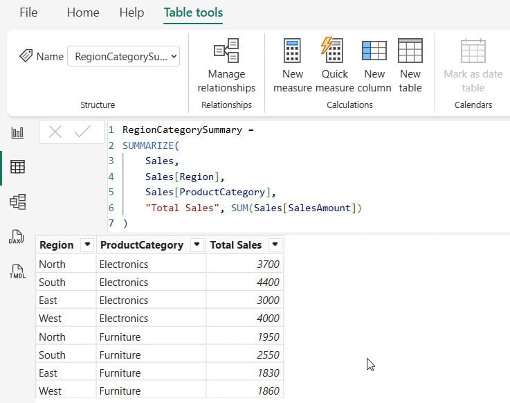
SUMMARIZE groups the Sales table by Region and ProductCategory, then adds a calculated column called “Total Sales” using SUM. This creates a static calculated table you can use for other visuals, custom sorting, or as a base for further calculations.
I don’t recommend overusing calculated tables — they add to your model size and don’t refresh as efficiently as measures. Reach for this approach only when you specifically need a physical grouped table, like feeding a decomposition tree or building a custom hierarchy. For general hierarchy needs across your dashboard, this guide on how to create a hierarchy in Power BI is a good companion read.
Putting It Together: A Real Sales Dashboard Example
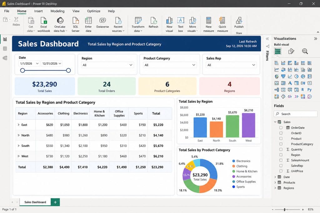
Here’s how I typically structure this on an actual sales dashboard for a retail client:
- Data model: One clean fact table (
Sales) withOrderDate,Region,ProductCategory,SalesAmount, connected to a proper Date table for time intelligence. - Measures:
Total Sales,Order Count, and a few CALCULATE-based measures for specific category or region cuts. - Visuals: A Matrix with
RegionandProductCategoryin rows,Total Salesin values, plus slicers for filtering by date or region. - Formatting: Subtotals enabled, conditional formatting on the value column to highlight top performers.
If you haven’t built your Date table yet, do that before anything else — nearly every grouped sales report eventually needs to slice by month or quarter, and retrofitting a date table later is painful. Here’s a solid walkthrough for creating a Date table in Power BI.
For readers still assembling the report from scratch, it’s worth stepping back and following a full guide to creating a Power BI report so the grouping logic sits inside a properly structured file from day one. And once your grouped totals need to reference values from a second, related table — for instance, pulling a target figure to compare against actual sales — check out this piece on how to combine columns from two tables in Power BI.
Things to Consider
- Measures beat calculated columns for aggregation. Always sum with a measure, not a calculated column, when the total needs to respond to slicers and filters dynamically.
- Avoid grouping in Power Query when you need drill-through. Once you group in Power Query, the detail rows are gone from that query — keep a separate detailed table if users need to click into individual transactions.
- Watch your Matrix subtotal settings. A common mistake is forgetting to enable subtotals, which makes it look like the report is missing totals when they’re just turned off in formatting.
- Sort grouped columns intentionally. Text columns like Region sort alphabetically by default — use Sort by column if you need a specific business order, like largest region first.
- Don’t overload one visual. Grouping by three or four columns in a single Matrix gets hard to read fast — consider splitting into separate visuals or adding a drill-down hierarchy instead.
- Check performance on large tables. SUMX iterates row by row, which can slow down on very large fact tables — test performance before rolling out to production if your table has millions of rows.
Frequently Asked Questions
How do I sum by two columns in Power BI without using a Matrix?
You can use Power Query’s Group By feature in Advanced mode to create a summarized table, or write a SUMMARIZE DAX formula to build a calculated table. Both approaches group your data by two columns outside of any visual.
What’s the difference between grouping in Power Query and grouping in a visual?
Grouping in Power Query permanently reshapes your data before it loads into the model, replacing detail rows with summary rows. Grouping in a visual like Matrix keeps your detailed data intact and only summarizes it for display, so filters and drill-throughs still work.
Why is my Matrix showing wrong totals when I group by multiple columns?
This usually happens because of incorrect filter context in a measure, often from using CALCULATE incorrectly, or because a relationship between tables is set up wrong. Double-check your Data model relationships and confirm your measure uses SUM or SUMX correctly instead of a hardcoded value.
Can I group by more than two columns in Power BI?
Yes. In a Matrix visual, you can stack as many fields as you want into the Rows or Columns area, and in Power Query’s Group By (Advanced mode), you can add unlimited grouping levels. Just be mindful that too many levels make the report harder to read.
Should I use SUM or SUMX when grouping by multiple columns?
Use SUM when you’re aggregating a single existing numeric column, like SalesAmount. Use SUMX when your total depends on a row-by-row calculation first, like multiplying Quantity by UnitPrice before adding everything up.
Grouping and summing by multiple columns really comes down to picking the right layer for the job — a visual for quick views, Power Query for permanent summary tables, and DAX measures for dynamic, filter-aware calculations. My advice is to start with a Matrix visual and DAX measures first, since they keep your model flexible, and only move to Power Query grouping once you’re certain you need a fixed summary table. I hope this walkthrough saves you some trial and error on your next report.
You may also like the following tutorials:
- Create a Power BI Dashboard: Examples and Best Practices
- Group By Date Range in Power BI
- Create a Measure by Category in Power BI
- Set Up Row-Level Security in Power BI
- Schedule Refresh in Power BI

After working for more than 18 years in Microsoft technologies like SharePoint, Microsoft 365, and Power Platform (Power Apps, Power Automate, and Power BI), I thought will share my SharePoint expertise knowledge with the world. Our audiences are from the United States, Canada, the United Kingdom, Australia, New Zealand, etc. For my expertise knowledge and SharePoint tutorials, Microsoft has been awarded a Microsoft SharePoint MVP (12 times). I have also worked in companies like HP, TCS, KPIT, etc.

