
I still remember the first dashboard I built for a regional sales team. I had slicers stacked on every page, and the report crawled. A senior BI lead on the client side asked me a simple question: “Why aren’t you using filters instead?” That one question changed how I design every report since.
If you’re building reports in Power BI Desktop and wondering whether to add a slicer on the canvas or use the Filter pane instead, you’re asking the right question. Both control what data shows up in your visuals, but they work very differently, and picking the wrong one can slow down your report or confuse your users.
In this article, I’ll walk you through exactly what separates a Power BI filter from a slicer, when to use each one, and how I decide between them on real client dashboards.
What Is a Filter in Power BI?
A filter in Power BI lives inside the Filter pane, usually docked on the right side of your report canvas. It lets you narrow down data without taking up visual space on the page. Filters work at three levels:
- Visual-level filter: Affects only one visual on the page.
- Page-level filter: Affects every visual on the current report page.
- Report-level filter: Affects every visual across every page in the report.
Filters are invisible to your end users unless you choose to show them. Someone viewing the published report in Power BI Service won’t see a filter unless they open the Filter pane themselves, or you pin it open.
I use filters constantly for background logic — things like excluding test records, hiding a specific product category the client doesn’t want shown, or restricting a page to a single fiscal year without cluttering the layout. You can learn the exact steps in this guide on how to add a filter in Power BI.
Pro Tip: I’ve found that report-level filters are the single most underused feature in Power BI. Instead of adding five page-level filters for the same condition, I set it once at the report level. It saves rework and keeps every page consistent.
What Is a Slicer in Power BI?
A slicer is a visual element you place directly on the report canvas, just like a chart or a table. Unlike a filter, a slicer is always visible to the person viewing the report. It gives end users a way to interactively change what data they see without needing any Power BI knowledge.
You’ll typically see slicers as dropdown lists, button groups, or date range pickers sitting at the top of a dashboard. If you’re new to adding one, this walkthrough on the Power BI slicer covers the basics from scratch.
Slicers exist because business users don’t want to dig into menus to change a view. A regional manager wants to click “West” and instantly see West region numbers. That’s the job a slicer does well.
Slicers come in several styles depending on your data and audience:
- Dropdown slicer: Good when you have many values and limited page space. See how to set one up with a dropdown slicer in Power BI.
- Checkbox slicer: Lets users pick multiple values at once. Covered in this slicer checkbox tutorial.
- Button slicer: Turns options into clickable buttons, which I use often on executive dashboards. Here’s how to build slicer buttons in Power BI.
- Search box slicer: Useful when a field has hundreds of unique values, like customer names. Steps are in this guide on the slicer search box.
- Date range slicer: Lets users pick a custom date window. Check out this tutorial on filtering between two dates using a slicer.
- Multi-column slicer: Combines two related fields, like Category and Sub-Category, into one control. Here’s how to set up a slicer with multiple columns.
Power BI Filter vs Slicer: The Core Differences
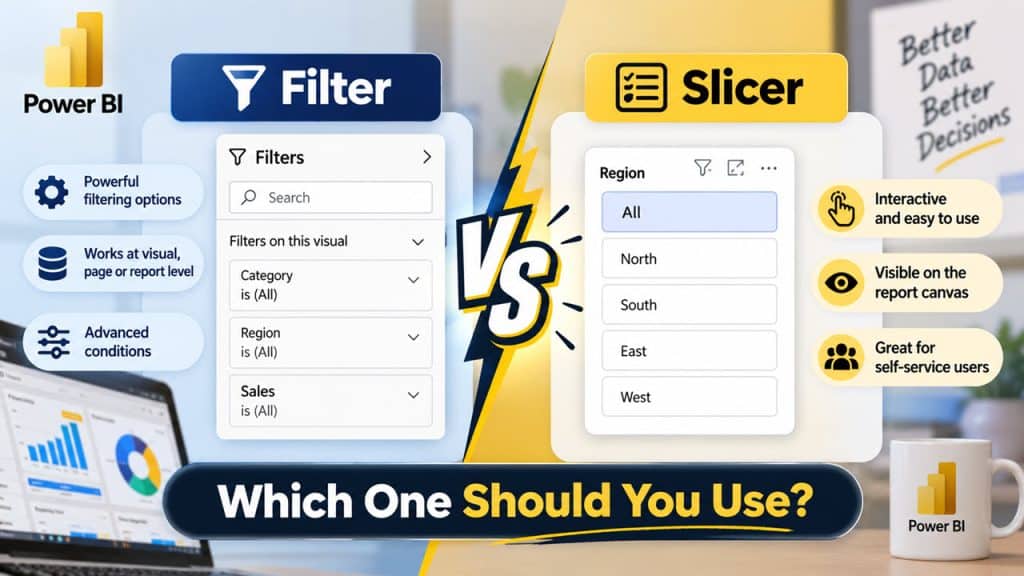
Here’s how I explain it to clients who are new to Power BI: a filter is something you, the report builder, set up so the data behaves correctly. A slicer is something the report viewer touches so they can explore the data themselves.
Visibility
Filters stay hidden inside the Filter pane by default. Slicers always sit on the canvas as a visible, interactive control. If your goal is a clean, self-explanatory dashboard, that visibility difference matters a lot.
Interactivity
A slicer is meant for the end user. They click it, change it, and immediately see the report respond. A filter is mostly set once by the report author and rarely touched again unless someone opens the Filter pane manually.
Screen Space
Slicers take up real canvas space — space you could otherwise use for charts or KPIs. Filters take up zero canvas space since they live in a side pane. On dashboards where space is tight, I lean heavily on filters and add only the slicers users truly need.
Performance
This is the one people miss. Every slicer you add creates an extra visual that Power BI has to render and refresh on every interaction. A page packed with ten slicers will feel noticeably slower than a page using two slicers plus a few well-placed filters. If your report already feels sluggish, this comparison of Power Query vs Power BI processing might help you understand where the real bottleneck sits.
Scope Control
Filters give you granular control — visual, page, or report level — from one place. Slicers only affect the page they’re placed on, unless you sync them across pages manually.
Editing Effort
Changing a filter condition takes a few clicks in the Filter pane and updates instantly for everyone viewing the report. Changing what a slicer controls, or how it looks, usually means going back into Power BI Desktop, adjusting the field, and republishing. This is another reason I keep fixed business rules in filters rather than slicers.
When to Use a Filter in Power BI
I reach for a filter whenever the logic should apply automatically, without requiring the user to do anything. Some real examples from my own projects:
- Excluding cancelled orders from a sales dashboard permanently.
- Restricting an entire report to the current fiscal year using a report-level filter.
- Hiding a “Test Region” that exists only for internal QA.
- Filtering a single table visual to show only top 10 customers, without affecting the rest of the page.
- Applying a date filter that always shows the last 90 days without a visible control. This is easy to set up using a Power BI date filter.
If you need dynamic filtering tied to a measure’s logic rather than a static condition, look into filtering a measure in Power BI or building a measure with a filter argument directly in DAX.
When to Use a Slicer in Power BI
I add a slicer whenever the end user genuinely needs to change the view themselves. A few scenarios where slicers are the right call:
- A sales dashboard where regional managers select their own region.
- An HR headcount dashboard where users filter by department or employment status.
- A finance report where the finance team picks a custom date range each month.
- A multi-region report where each viewer needs to isolate just their own numbers on demand.
For dashboards with several related dropdowns, you might also want one slicer to filter another. Here’s how I’ve built that using slicers that filter another slicer on the same page. It’s also worth learning how to get the selected value from a slicer, since this comes up often when you want a card or title to reflect the user’s current selection.
Building a Sample Sales Dashboard: Filters and Slicers Together
Let’s say I’m building a sales dashboard for a mid-sized retail company. Here’s how I’d typically split the work between filters and slicers.
First, I load sales data and build the data model, connecting a Date table to my sales table. A proper Date table is essential for any time-based filtering to work correctly — I always recommend starting with this guide on how to create a Date table in Power BI.
Next, I create a core measure:
Total Sales = SUM(Sales[Amount])This measure calculates total revenue and reacts to whatever filter context is active on the page — whether that’s from a slicer or a filter. If you want to see more measure patterns like this, check out these Power BI measure examples, or learn the full basics of how to create a measure in Power BI from scratch.
Now for the interactive layer, I add a Region slicer at the top of the page so sales managers can instantly switch between regions. I also add a date range slicer so they can compare custom periods.
Behind the scenes, I set a report-level filter to exclude any orders marked as “Returned,” since the client never wants returned orders counted toward sales figures on any page. That filter runs quietly in the background — no slicer needed, because no user should ever need to turn it off.
Finally, I add visuals: a card for Total Sales, a bar chart for Sales by Region, and a matrix for Sales by Product Category. Each one responds automatically to both the slicer selections and the hidden filters. If a category has no sales in a given month, I also make sure to check showing items with no data in Power BI so the matrix doesn’t silently drop rows the client expects to see.
Pro Tip: In my experience, mixing filters and slicers this way — slicers for what users need to control, filters for what should always apply — cuts page load times noticeably compared to dashboards that rely on slicers for everything.
Once the dashboard is ready, I publish it to Power BI Service inside a workspace, so the whole sales team can access it through a browser or the mobile app. If sensitive numbers need protecting by region, you can layer in Row-Level Security on top of your filters and slicers for an extra layer of control. I also set up a scheduled refresh in Power BI so the underlying data stays current without anyone manually reloading it.
Things to Keep in Mind
- Too many slicers hurt performance. Each slicer is a live visual. Stick to two or three per page and move the rest into filters.
- Use report-level filters for global rules. If a condition should apply everywhere, set it once at the report level instead of repeating it on every page.
- Sync slicers carefully across pages. Slicer sync is powerful but can confuse users if a selection on one page silently changes another page they haven’t visited yet.
- Set default values on slicers. An empty slicer confuses first-time viewers. Learn how to set a default value in a Power BI slicer so the dashboard opens with sensible numbers already showing.
- Don’t rely only on filters for security. Filters can be removed or edited by anyone with report access. For true data protection, use Row-Level Security instead.
- Check how slicers interact with measures. If your DAX depends on user selection, review how to build a measure based on a slicer so your numbers stay accurate.
- Clear blank values from your slicers. Blank or null entries in a field can show up as a confusing empty option in a slicer. It’s worth learning how to remove blanks from a slicer in Power BI before you publish.
Frequently Asked Questions
Can I use both filters and slicers on the same report page?
Yes, absolutely. In fact, most well-built dashboards use both together. Slicers handle what the end user wants to control, while filters handle background rules the user shouldn’t need to touch.
Do slicers affect all pages in a Power BI report?
By default, a slicer only affects the page it’s placed on. You can make it affect other pages by turning on Sync slicers, which lets you apply the same selection across multiple report pages.
Which one is better for performance, filters or slicers?
Filters are generally lighter on performance because they don’t render as separate visuals. If your report feels slow, reducing the number of slicers on a page is one of the fastest fixes.
Can I hide a filter from report viewers?
Filters in the Filter pane are already hidden from casual viewers unless they open the pane. You can also lock filters so viewers can see them but not change the selections, or remove viewer access to the Filter pane entirely in Power BI Service.
Why would I use a filter instead of just making a slicer invisible?
You could technically shrink a slicer down to zero size, but that’s a workaround, not a real solution. A true filter is more efficient, easier to manage at scale, and doesn’t create an unnecessary visual object on your page.
What’s the difference between a slicer and a dropdown filter visual?
A slicer is a visual you place on the canvas, and it can appear as a list, dropdown, or buttons. A filter, on the other hand, always lives in the Filter pane and never appears as a canvas object, regardless of its style.
Can a slicer selection carry over when I export my report to Excel?
Yes, when you export data from a visual, Power BI applies whatever filters and slicer selections are currently active. If you’re setting up exports for stakeholders, it helps to understand how to export data from Power BI so the exported file matches exactly what the user sees on screen.
Power BI Filter vs Slicer really comes down to control versus interactivity — filters quietly manage what data appears, while slicers hand that control directly to your report viewers. Start every dashboard by deciding which conditions are fixed rules and which ones your users should control themselves, then build filters and slicers around that split. I hope this article helped clear up when to use each one on your next report.
You may also like the following tutorials:
- How to Create a Dashboard in Power BI
- Sum and Group By Multiple Columns in Power BI
- Enable Multiple Selections in a Power BI Slicer
- Power BI Dashboard Examples for Inspiration
- How to Create a Power BI Report from Scratch
- Power BI KPI Visual: How to Use It

After working for more than 18 years in Microsoft technologies like SharePoint, Microsoft 365, and Power Platform (Power Apps, Power Automate, and Power BI), I thought will share my SharePoint expertise knowledge with the world. Our audiences are from the United States, Canada, the United Kingdom, Australia, New Zealand, etc. For my expertise knowledge and SharePoint tutorials, Microsoft has been awarded a Microsoft SharePoint MVP (12 times). I have also worked in companies like HP, TCS, KPIT, etc.


Slicer and page level filter works same ….both filters data on selected page . then what is the main difference between slicer and page level filter? When we use slicer and when we use page level filter? I’m new to power bi….please clarify my query