
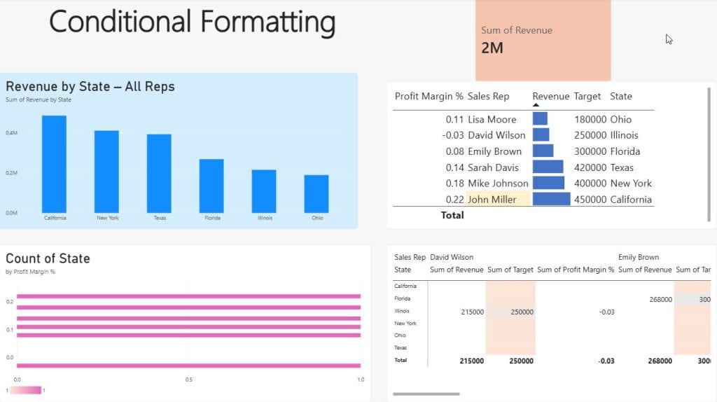
A table full of numbers is hard to read. Conditional formatting fixes that by coloring, highlighting, or tagging values automatically, so readers can spot problems right away. With it, a sales manager in Chicago can see underperforming states without reading every row.
This guide covers every type of conditional formatting in Power BI Desktop: background color, font color, data bars, icons, and web URLs, plus the three format styles (Gradient, Rules, and Field value). The examples use one simple US retail sales dataset throughout.
If you’re new to Power BI, start with how to install and use Power BI Desktop, then come back here.
What Is Conditional Formatting in Power BI?
Conditional formatting changes how a value looks based on the value itself or on another field or measure. Instead of formatting cells one by one, you set a rule once, and Power BI applies it to every value. It updates automatically when filters, slicers, or data refreshes change the numbers.
Where Can You Use Conditional Formatting in Power BI?
| Visual | Supported formatting |
|---|---|
| Table and Matrix | Background color, font color, data bars, icons, web URL |
| Bar / Column charts | Bar/column color |
| Line and Area charts | Line/marker color (limited), area fill |
| Card and KPI | Callout value color, title |
| Gauge | Fill color, target color |
| Pie / Donut | Slice colors |
| Most visuals | Title text, title color, background (via fx) |
The table and matrix visuals offer the most options, so most of this guide uses them.
Types of Conditional Formatting in Power BI
- Background color colors the entire cell.
- Font color colors the text only.
- Data bars draw an in-cell bar chart.
- Icons add symbols such as arrows, traffic lights, and flags.
- Web URL turns a value into a clickable link.
The Three Format Styles: Gradient vs. Rules vs. Field Value
| Format style | Best for | Example |
|---|---|---|
| Gradient | Continuous numbers | Revenue from light to dark blue |
| Rules | Thresholds and buckets | Margin < 10% = red |
| Field value | Full control with DAX | A measure returns “#1E8449” |
Sample Dataset Used in This Tutorial
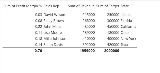
The examples use a simple US Sales table:
| State | Sales Rep | Revenue ($) | Target ($) | Profit Margin % |
|---|---|---|---|---|
| California | John Miller | 485,000 | 450,000 | 22% |
| Texas | Sarah Davis | 392,000 | 420,000 | 14% |
| New York | Mike Johnson | 410,000 | 400,000 | 18% |
| Florida | Emily Brown | 268,000 | 300,000 | 8% |
| Illinois | David Wilson | 215,000 | 250,000 | -3% |
| Ohio | Lisa Moore | 189,000 | 180,000 | 11% |
Load it, then add a Table visual with all five columns. For help, see how to create a table in Power BI.
How to Open Conditional Formatting in Power BI (2 Ways)
Let’s see the 2 ways to open conditional formatting in Power BI.
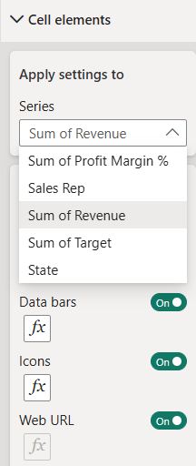
Method 1: From the Format Pane (Recommended)
- Select your table visual.
- In the Visualizations pane, click Format visual (the paintbrush icon).
- Expand Cell elements.
- Under Apply settings to, choose the column (series), for example Revenue.
- Turn on Background color, Font color, Data bars, Icons, or Web URL.
- Click the fx button to open the advanced settings.
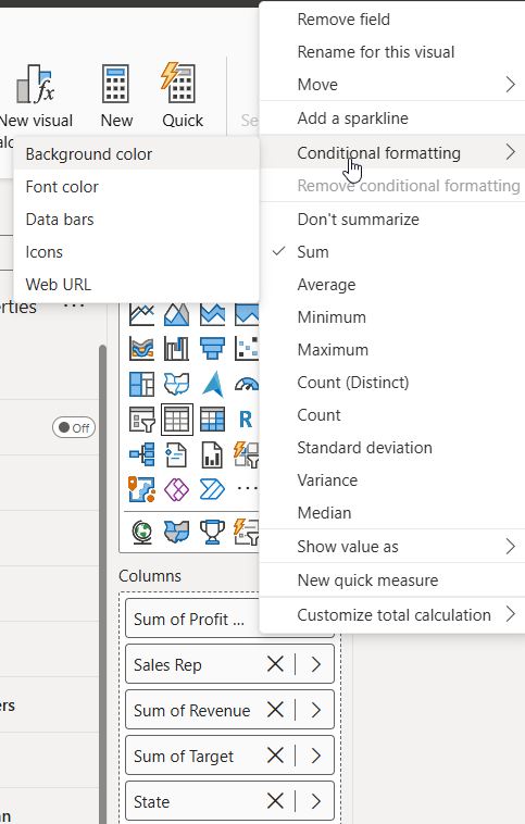
Method 2: From the Field Well (Right-Click)
- In the Columns field well, click the dropdown arrow next to a field.
- Select Conditional formatting.
- Choose Background color, Font color, Data bars, Icons, or Web URL.
Note: Conditional formatting only works on numeric fields or on fields you aggregate, such as Count or First. For text columns, use the Field value style with a DAX measure.
How to Add Background Color Conditional Formatting in Power BI
Background Color Using Gradient
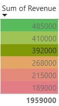
Use this for a heat-map effect on the Revenue column.
- Go to Cell elements → Apply settings to: Revenue → turn on Background color → click fx.
- Format style: Gradient.
- What field should we base this on? Sum of Revenue.
- Minimum: Lowest value → choose a light color (#DEEBF7).
- Maximum: Highest value → choose a dark color (#2171B5).
- Optional: check Add a middle color for a three-color scale, such as red → yellow → green.
- Click OK.
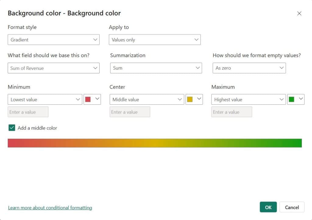
California now shows the darkest blue and Ohio the lightest.
Background Color Using Rules
Rules work best when your business has clear thresholds, like a margin target.
- Choose Apply settings to: Profit Margin % → Background color → fx.
- Format style: Rules.
- Add these rules:
| If value | And | Then color |
|---|---|---|
| >= 0.20 (Number) | <= 1 (Number) | Green #C6EFCE |
| >= 0.10 (Number) | < 0.20 (Number) | Yellow #FFEB9C |
| >= -1 (Number) | < 0.10 (Number) | Red #FFC7CE |
- Click OK.
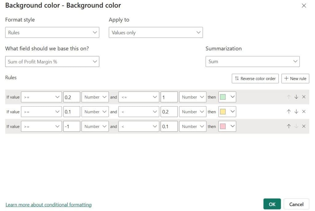
⚠️ Common mistake: Number vs. Percent. In the rules dialog, Percent means a percentage of the column’s range (min to max), not the value itself. If your column stores 22% as 0.22, choose Number and enter 0.22.
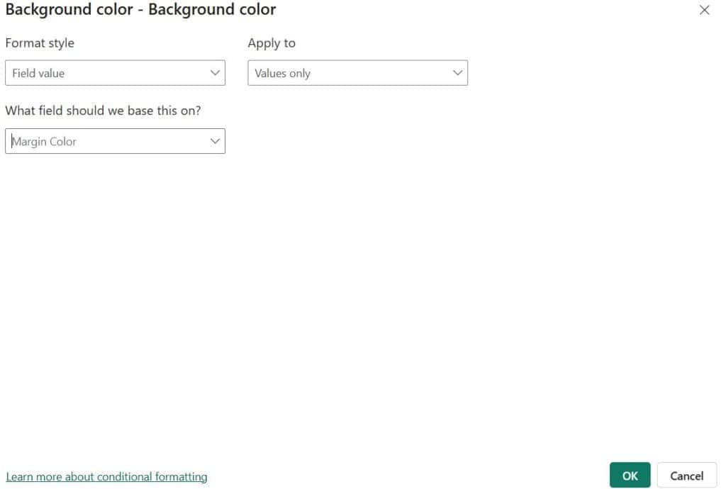
Background Color Using Field Value (DAX Measure)
This is the most flexible method. Write a measure that returns a hex code or color name. If you need a refresher, read how to create a measure in Power BI.
Margin Color =
VAR Margin = SUM ( 'US Sales'[Profit Margin %] )
RETURN
    SWITCH (
        TRUE (),
        Margin >= 0.20, "#1E8449",
        Margin >= 0.10, "#F4D03F",
        "#C0392B"
)- Choose Background color → fx → Format style: Field value.
- What field should we base this on? Margin Color.
- Click OK.
The SWITCH(TRUE()) pattern is explained in depth in this Power BI SWITCH measure guide.
How to Change Font Color Based on Value in Power BI
Font color uses the same dialog as background color. A classic use is red for below target, green for above target.
Target Font Color =
IF (
    SUM ( 'US Sales'[Revenue] ) >= SUM ( 'US Sales'[Target] ),
    "Green",
    "Red"
)- Choose Apply settings to: Revenue → turn on Font color → fx.
- Format style: Field value → Target Font Color.
- Click OK.
Texas, Florida, and Illinois turn red because they missed target. For more patterns, see Power BI IF measure examples.
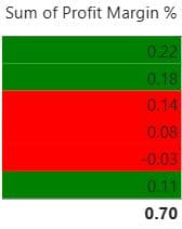
Accessibility tip: About 1 in 12 American men has some form of color blindness. Don’t rely on red and green alone. Add icons or labels too.
How to Add Data Bars in Power BI
Data bars put a small bar chart inside each cell, which makes size comparisons easy.
Steps to Add Data Bars
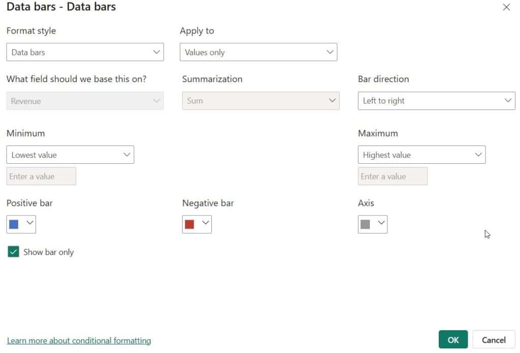
- Choose Apply settings to: Revenue → turn on Data bars → fx.
- Configure these settings:
- Minimum / Maximum: Lowest value / Highest value (or set a custom number).
- Positive bar: blue (#4472C4).
- Negative bar: red (#C0392B).
- Axis: gray.
- Bar direction: Left to right.
- Show bar only: check this to hide the numbers.
- Click OK.
Data Bars with Negative Values
The Profit Margin % column includes Illinois at -3%. Turn on data bars there, and Power BI draws an axis with the negative bar going left in red. This makes data bars great for variance and profit/loss columns.
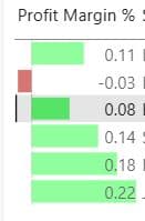
Pro tip: Widen the column. Data bars on narrow columns are hard to read. See how to format a table visual in Power BI.
How to Add Icons in Power BI Conditional Formatting
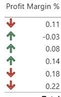
Icons work like traffic lights in your report. Executives can scan them in seconds.
Add Icons Using Rules
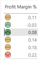
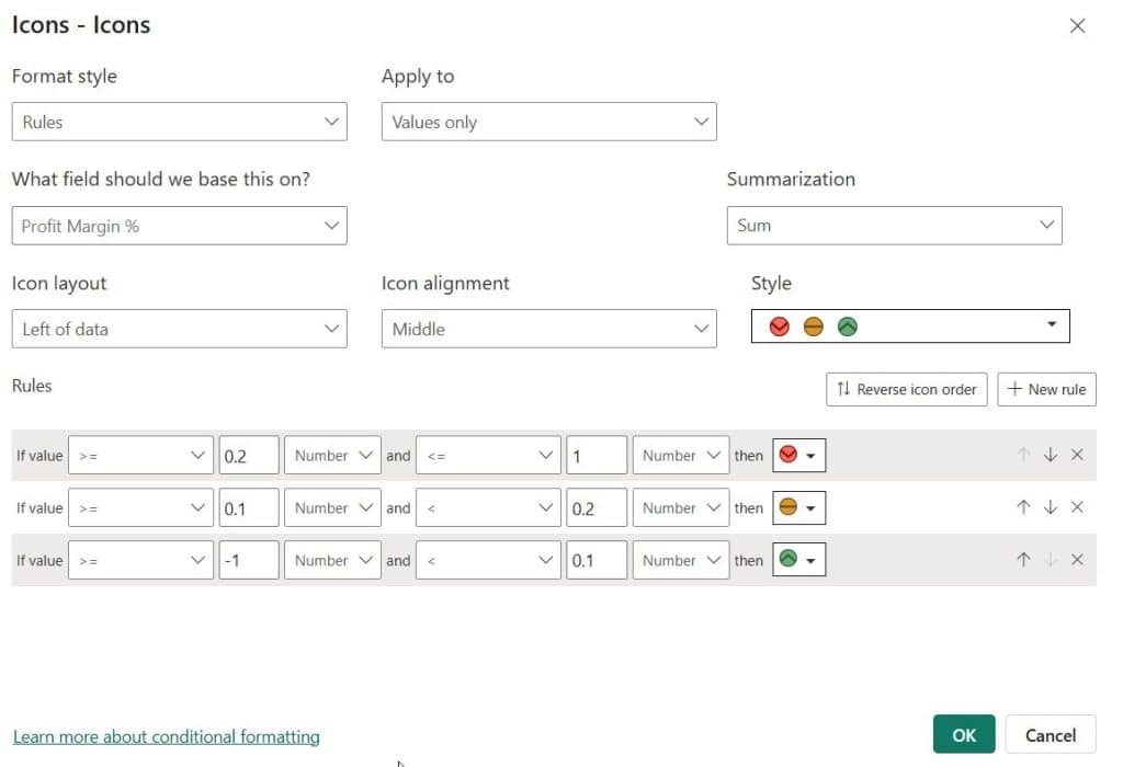
- Choose Apply settings to: Profit Margin % → turn on Icons → fx.
- Format style: Rules.
- Icon layout: Left of data (or Right of data, or Icon only).
- Icon alignment: Middle.
- Style: pick a preset, such as 3 traffic lights or 3 arrows.
- Adjust the rules:
| If value | And | Icon |
|---|---|---|
| >= 0.20 | <= 1 | 🟢 Green circle |
| >= 0.10 | < 0.20 | 🟡 Yellow circle |
| >= -1 | < 0.10 | 🔴 Red diamond |
- Click OK.
Show Icons Only (Hide the Number)
Set Icon layout to Icon only. This works well for “Status” columns on executive dashboards. If you’re building one, here’s how to create a dashboard in Power BI.
Icons Based on Another Measure (Target vs. Actual)
In What field should we base this on?, pick a different measure, such as a variance measure:
Revenue vs Target % =
DIVIDE (
    SUM ( 'US Sales'[Revenue] ) - SUM ( 'US Sales'[Target] ),
    SUM ( 'US Sales'[Target] )
)
Then set rules: ≥ 0 → up arrow, < 0 → down arrow. Learn more about DIVIDE in Power BI measures.
How to Apply Conditional Formatting to Text Columns in Power BI
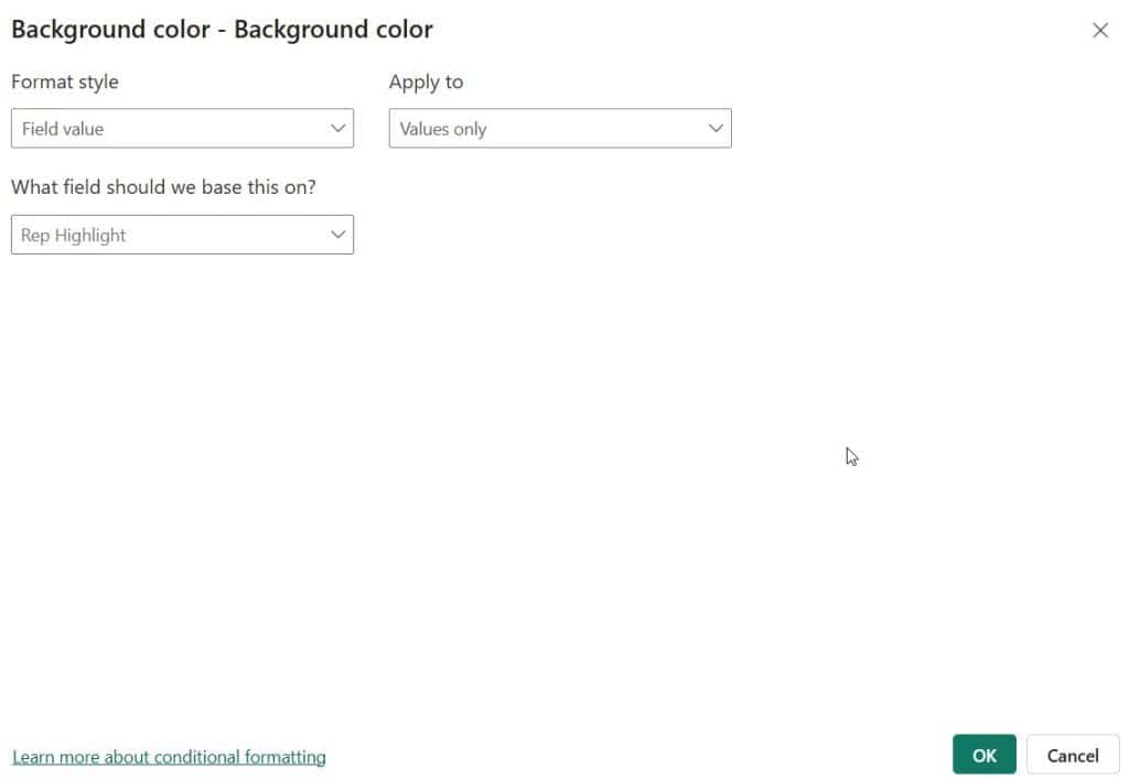
You can’t use Gradient or Rules on a text column directly, but Field value works on any column.
Rep Highlight =
IF (
    SELECTEDVALUE ( 'US Sales'[Sales Rep] ) = "John Miller",
    "#FFF2CC",
    BLANK ()
)
Apply it to the Sales Rep column as a background color with Field value. You can also use the Rules style on a text column by basing it on a numeric field, such as Sum of Revenue.
How to Add Conditional Formatting in a Power BI Matrix
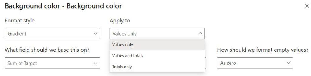
A matrix works like a table, with one extra choice: Apply to.
- Values only: formats the detail cells.
- Values and totals: also formats subtotals and grand totals.
- Totals only: formats only the totals.
Usually choose Values only. Totals are much larger and can throw off a gradient. For a full walkthrough, see Power BI matrix visual conditional formatting.
How to Add Conditional Formatting in Power BI Charts
Bar and Column Charts
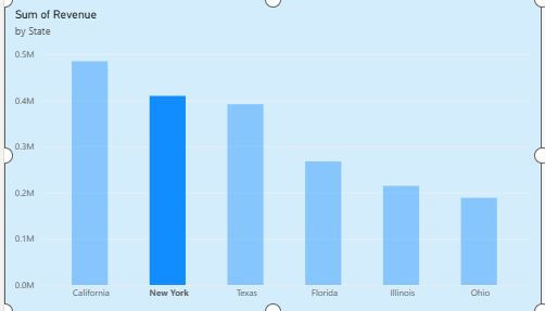
- Select the chart → Format visual → Bars (or Columns) → Color → fx.
- Use Gradient, Rules, or Field value.
Important: The fx button is hidden when the chart has a field in Legend or uses multiple measures. Remove the legend to enable it.
Step-by-step guides:
- Conditional formatting in a Power BI bar chart
- Conditional formatting in a Power BI stacked column chart
Line, Area, Pie, and Gauge Charts
Each chart type has its own options and limits:
- Conditional formatting in a Power BI line chart
- Area chart conditional formatting in Power BI
- Power BI pie chart conditional formatting
- Conditional formatting in a Power BI gauge chart
Cards and KPI Visuals
In a card, go to Callout value → Color → fx to make the big number turn red or green. Learn more about the Power BI card visual and Power BI KPI visual.
Dynamic Titles with Conditional Formatting
Click fx next to Title text and choose a measure:
Dynamic Title =
"Revenue by State – " & SELECTEDVALUE ( 'US Sales'[Sales Rep], "All Reps" )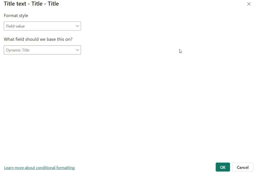
How to Edit, Copy, or Remove Conditional Formatting in Power BI
- Edit: Click fx again, or right-click the field → Conditional formatting.
- Remove: Right-click the field → Remove conditional formatting → choose the type (or All). You can also just turn the toggle off.
- Copy to other visuals: Use Format Painter on the Home ribbon. It copies most formatting between visuals of the same type.
- Reuse colors: Store color logic in DAX measures. One measure can feed many visuals, so a color change only needs to be made once.
Power BI Conditional Formatting Best Practices
- Use 3 colors or fewer. More colors become noise.
- Keep meanings consistent. Green = good, red = bad on every page.
- Choose colorblind-safe palettes. Blue/orange works for more readers than red/green.
- Use DAX measures for business logic so thresholds live in one place.
- Handle blanks. In the dialog, set How should we format empty values? to Don’t format to avoid confusing colors.
- Exclude totals from gradients in a matrix.
- Test with slicers. Gradients recalculate based on visible data. See Power BI measures based on slicer.
- Don’t overdo it. If everything is highlighted, nothing stands out.
Troubleshooting: Power BI Conditional Formatting Not Working
| Problem | Fix |
|---|---|
| fx button missing on chart | Remove the field from Legend, or use a single measure |
| Rules not coloring correctly | Switch Percent to Number in each rule |
| Text column can’t be formatted | Use Field value with a DAX measure |
| Field value measure ignored | Make sure it returns valid text: “#RRGGBB” or a color name like “Red” |
| Totals look wrong | Set Apply to to Values only |
| Colors change when filtering | Expected with Gradient; use fixed numbers in Rules instead |
| Measure not showing in “Based on” list | The measure must return the right data type (numeric for rules, text for field value) |
Frequently Asked Questions (FAQ)
How do I add conditional formatting in Power BI?
Select a table or matrix, open Format visual → Cell elements, pick the column under Apply settings to, turn on Background color, Font color, Data bars, or Icons, then click fx to set Gradient, Rules, or Field value.
Can I do conditional formatting based on another column in Power BI?
Yes. In the fx dialog, change What field should we base this on? to any other column or measure. For example, you can color Revenue by Profit Margin.
How do I use a DAX measure for conditional formatting in Power BI?
Create a measure that returns a hex code (like “#1E8449”) or a color name. In the fx dialog, choose Format style: Field value and select that measure.
Can I apply conditional formatting to an entire row in Power BI?
Not with a single setting. Create one color measure and apply it with Field value to every column. The whole row will then share the same color.
Why is conditional formatting not available on my bar chart?
The fx option is hidden when the chart uses a Legend or more than one measure. Remove the legend or extra measures to enable it.
Can I use conditional formatting on text values in Power BI?
Yes. Use Field value with a measure such as IF(SELECTEDVALUE(Table[Status])=”Late”,”Red”,”Green”).
What is the difference between Percent and Number in Power BI rules?
Number compares the actual value. Percent compares the value’s position between the column’s minimum and maximum. Most users want Number.
Does conditional formatting work in the Power BI service and mobile app?
Yes. Formatting created in Power BI Desktop carries over when you publish to the Power BI service and also shows in the mobile apps.
Can I add custom icons in Power BI?
The Rules style offers built-in icon sets. For fully custom images, return an image URL or SVG from a measure and set the column’s data category to Image URL.
How do I remove conditional formatting in Power BI?
Right-click the field in the field well → Remove conditional formatting, or turn off the toggle under Cell elements.
Conclusion
Conditional formatting turns static Power BI reports into reports that show where to look. To recap:
- Background and font color highlight good and bad values.
- Data bars compare magnitude inside a table.
- Icons give a quick status at a glance.
- Gradient, Rules, and Field value cover everything from heat maps to complex DAX logic.
Start with one rule on your most important KPI, check it with real users, then expand. Next, try these Power BI measure examples or browse all Power BI tutorials on EnjoySharePoint.

I have worked with Microsoft technologies for more than 18 years, including SharePoint, Microsoft 365 and the Power Platform (Power Apps, Power Automate and Power BI), at companies like HP, TCS and KPIT. I started EnjoySharePoint in 2011 to share the solutions I build in real projects with readers in the United States, Canada, the United Kingdom, Australia, New Zealand and beyond. Microsoft has recognised this work with the Microsoft MVP award 13 times since 2014.